Disclosure Sponsored Links: This post contains a paid-for sponsored link, meaning we have received compensation in exchange for including it. Sponsorship does not influence our content, but we believe in transparency regarding paid placements.
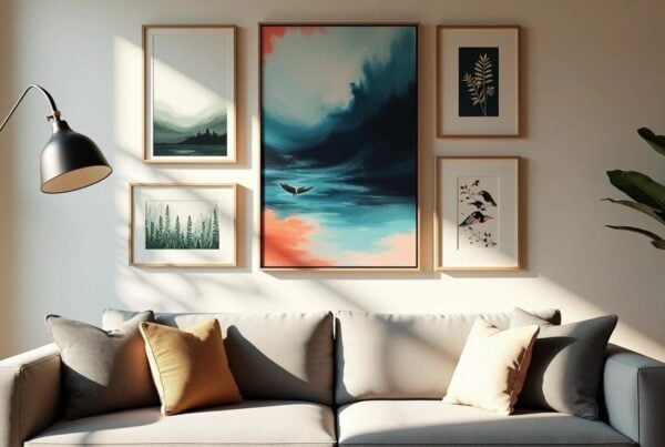
When most people buy a poster or art print, they think about the image — the composition, the colours, the mood. What they rarely consider is the paper it’s printed on.
And yet the paper is doing an enormous amount of work. It determines how colours read in different lighting conditions, how the print ages over time, how it sits behind glass, and ultimately how it looks on your wall five or ten years from now. Two prints of the same image on different paper stocks can look like entirely different objects. One might feel like something you’d find in a student flat; the other, like something hanging in a gallery.
Understanding poster paper is one of the most overlooked aspects of buying wall art — and getting it right makes a visible, lasting difference.
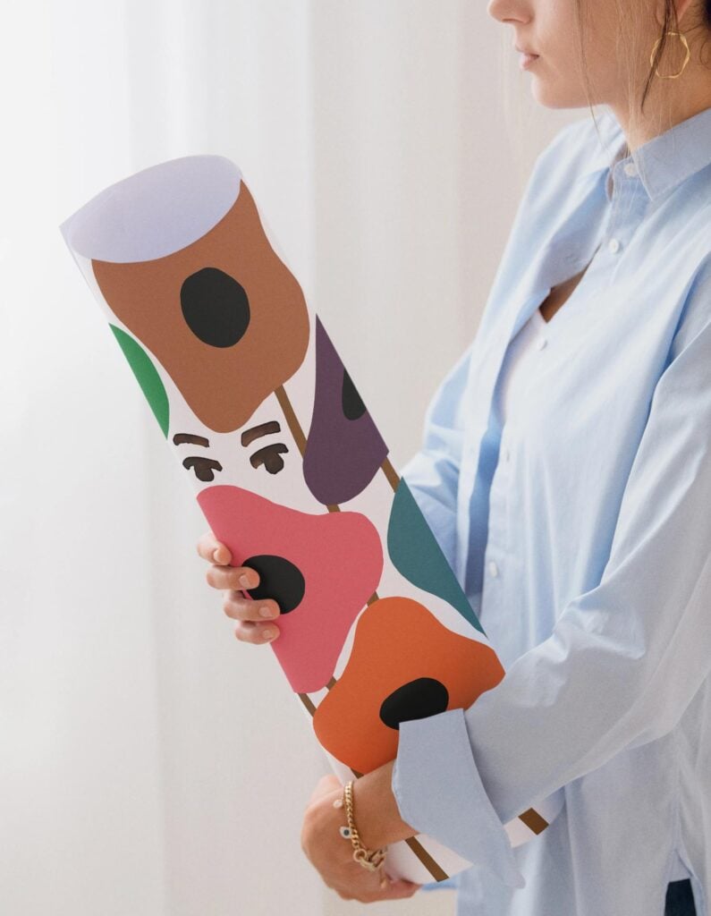
Table of Contents
The Main Types of Poster Paper
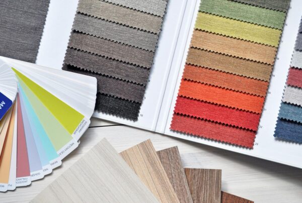
“Poster paper” is not a single thing. It’s a broad category containing dozens of substrates, weights, and surface finishes, each with distinct visual and tactile properties. For wall art and home décor, the options break down into a few key categories.
Glossy Paper
Gloss is the most immediately striking finish. Its shiny, reflective surface makes colours appear vivid and saturated — impressive at first glance, particularly under bright light.
The problem is that gloss creates significant glare from any direction. In a domestic setting — where lighting shifts throughout the day and where prints are viewed from multiple positions — this becomes a constant annoyance. Gloss paper also picks up fingerprints easily and can develop an uneven sheen over time. For prints intended to live on a wall, it’s rarely the right choice.
Satin and Semi-Gloss
Satin finishes sit between gloss and matte. They offer slightly more colour vibrancy than pure matte while reducing some glare. In practice, though, they inherit weaknesses from both ends: still reflective at certain angles, and lacking the warmth and depth of a true matte surface. For art prints, satin tends to feel like a compromise rather than a considered choice.
Standard Matte Paper
Standard matte eliminates glare almost entirely, producing a flat, even surface that reads consistently from any viewing angle. Colours appear natural and balanced, and the surface resists fingerprints and handling marks far better than gloss.
The limitation is weight and substance. Lighter matte stocks — typically below 170gsm — can feel flimsy, are prone to curling in humid environments, and lack the tactile quality that makes a print feel like a genuine object rather than a sheet of paper with an image on it.
Heavy Matte Paper
This is where things get seriously good.
Heavy matte paper — typically 200gsm and above, often running to 230gsm or higher in premium production — combines everything that makes standard matte desirable with a physical substance that transforms how a print looks and feels. This is the stock used for high-end art prints, museum-quality reproductions, and the kind of wall art you put up once and don’t take down.
Why Heavy Matte Is the Superior Choice for Wall Art
The case for heavy matte is grounded in concrete, practical advantages.
It holds its shape. Lighter papers curl and buckle — particularly when exposed to humidity or mounted without adequate backing. A heavy matte print lies flat and stays flat. A poster bowing behind glass is a dispiriting thing; it simply doesn’t happen with proper weight stock.
It absorbs ink beautifully. The matte coating holds pigments in place, producing colours that are accurate, even, and consistent across the entire surface — no pooling, no washed-out areas, no uneven absorption.
It has zero glare. A heavy matte print can sit opposite a window, beneath a spotlight, or in a room where lighting shifts all day, and it will look the same from every angle. The image is always the focus, never a distracting reflection.
It feels like an art object. There’s a substantial difference in how a heavy matte print feels compared with a lightweight glossy sheet. The weight communicates quality. When someone picks a print off your wall to look more closely — and they will — that physical quality registers immediately.
It frames exceptionally well. Heavy matte paper sits cleanly behind glass, maintains its shape inside the mount, and doesn’t develop the creases or pressure marks that lighter stocks can show when framed. The result looks genuinely professional.
It ages with dignity. Quality matte paper, printed with archival pigment inks, resists fading and yellowing over time. A well-made heavy matte print displayed away from direct sunlight can look essentially unchanged after a decade or more.
The Role of Giclée Printing
Paper quality and print process go hand in hand. Giclée printing — which uses archival pigment inks applied with precision inkjet technology — is the method that makes heavy matte paper truly sing. The fine droplets of pigment ink are absorbed evenly into the matte coating, producing colour accuracy and tonal range that traditional offset printing simply can’t match. If you’d like to go deeper on how paper choice interacts with the giclée process specifically, Hickman Design’s guide on choosing the best paper for giclée printing is a thorough and useful read.
The combination of heavy matte paper and giclée printing is, for all practical purposes, the gold standard for art reproduction today.
What to Look for When Buying Art Prints
- Check the paper weight. Look for 200gsm or above for serious wall art. Anything below 170gsm warrants caution.
- Look for matte or fine art matte finishes. Terms like “fine art matte”, “museum matte”, and “heavyweight matte” are good indicators. Avoid prints listed only as “glossy” for wall display.
- Ask about the printing process. Giclée on heavy matte is the benchmark to look for.
- Size up if you’re unsure. Heavy matte handles scale beautifully. A large-format print on quality stock looks genuinely impressive in a way that a smaller print on cheaper paper cannot replicate.
At Poster Room, prints are produced on heavy matte paper because it delivers the quality and longevity that wall art deserves — something that’s immediately apparent when you hold one, and even more so once it’s framed and on your wall.
Pairing Paper Quality with the Right Image
Heavy matte particularly suits:
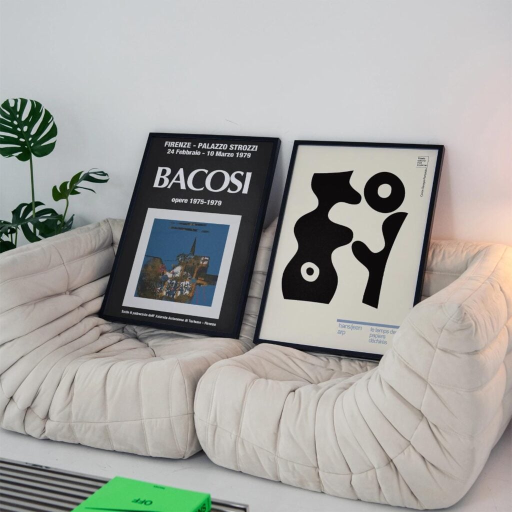
- Fine art reproductions — works by Klimt, Matisse, or Van Gogh lose nothing of their depth and texture on matte paper, which echoes the quality of the original media.
- Graphic and typographic prints — bold colour and clean linework are rendered with exceptional precision on a non-reflective surface.
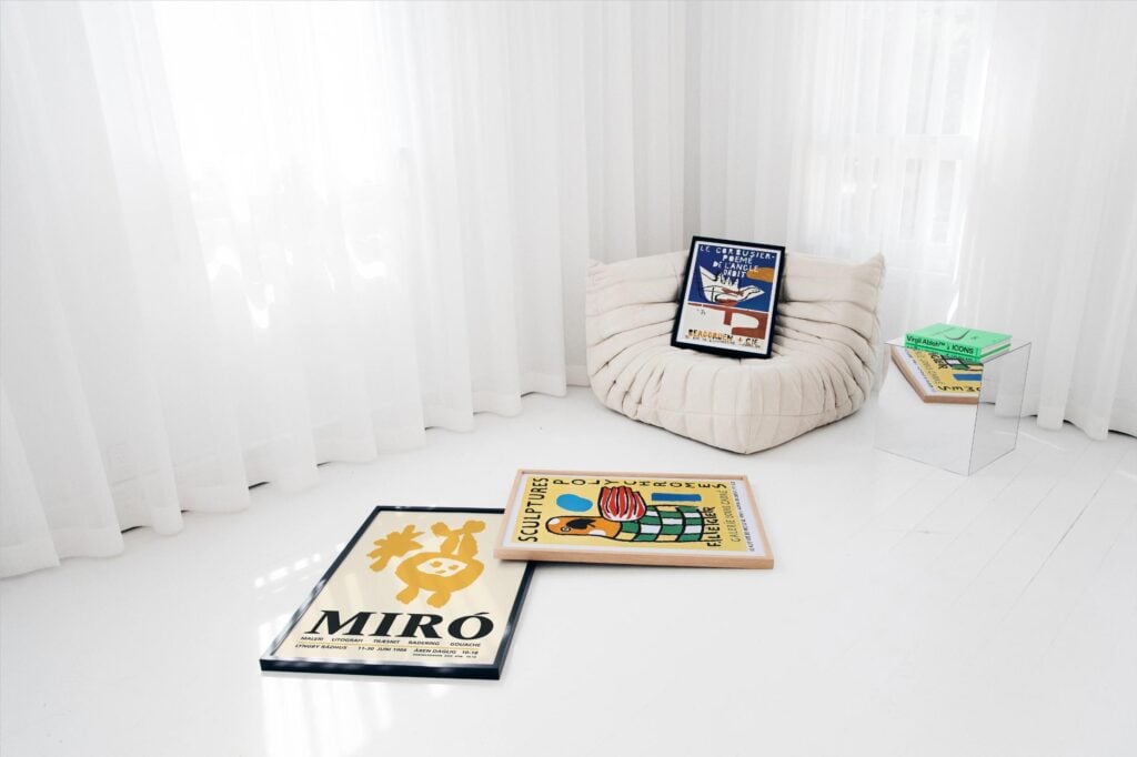
- Exhibition and gallery posters — the considered, contemplative visual language of the great museum poster is perfectly matched by heavy matte. The art exhibition posters collection at Poster Room shows how well this genre translates to the format.
- Botanical and nature prints — subtle gradations and fine detail are reproduced faithfully, without the colour blooming that gloss can introduce.
The Bottom Line
Poster paper is not a minor detail. It is the physical foundation of every print you display, and it shapes your experience of that print every single day. Glossy paper impresses briefly and frustrates over time. Lightweight matte is serviceable but lacks conviction. Heavy matte paper — properly weighted, properly coated, properly printed — is in a different category altogether.
When you’re next buying a print, don’t just think about the image. Think about what it’s printed on. The paper, it turns out, is half the picture.