
Last Updates Published: January 25, 2023

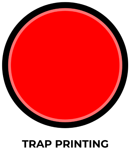
Simple Screen Printing Artwork Preparation Guide & Transparency Printing

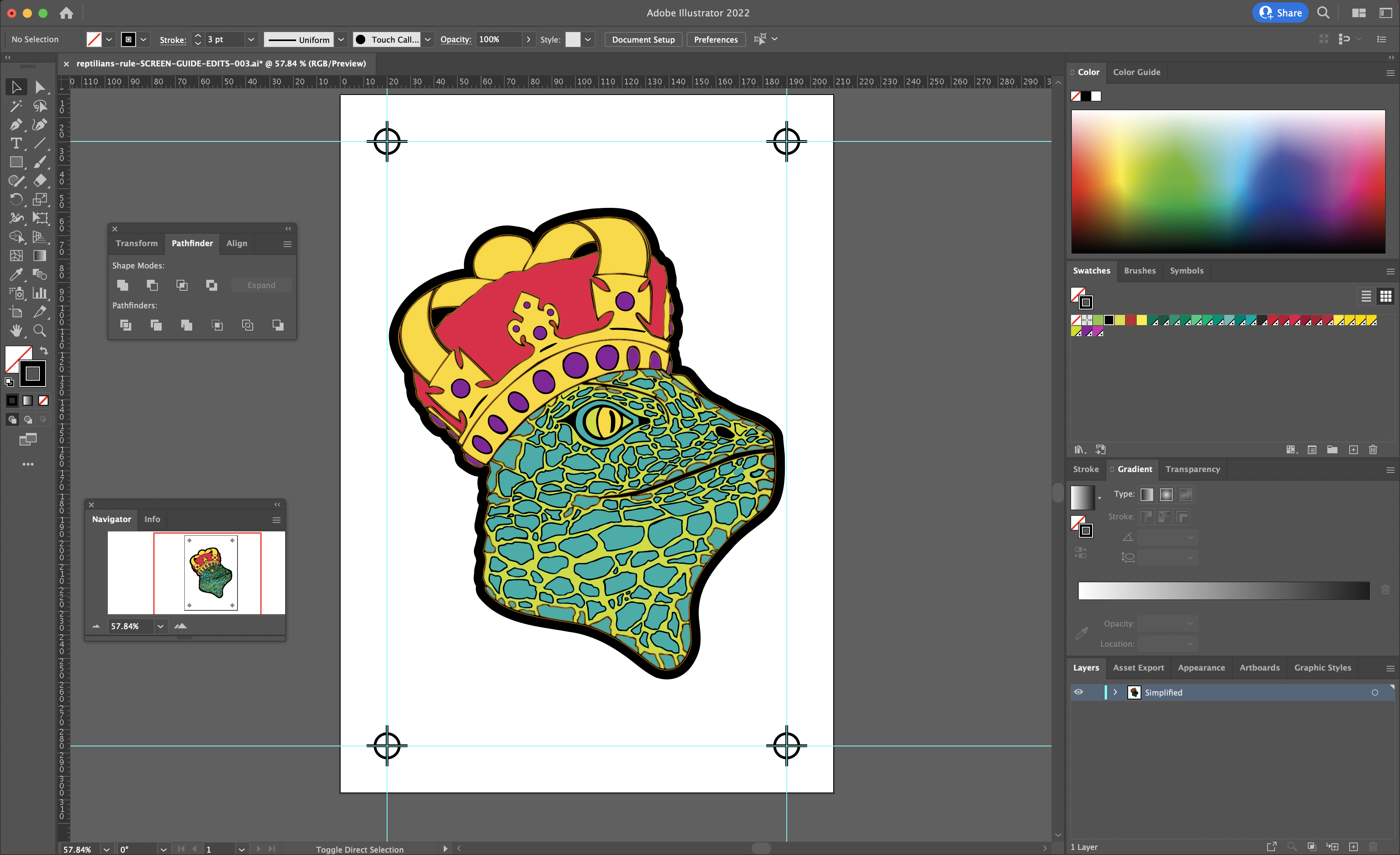
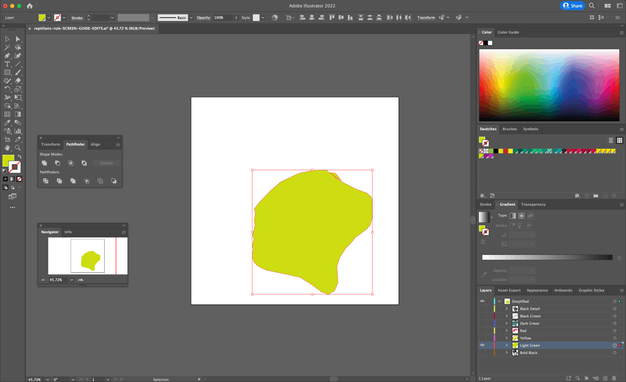
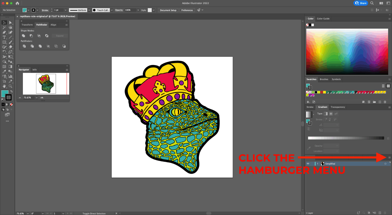
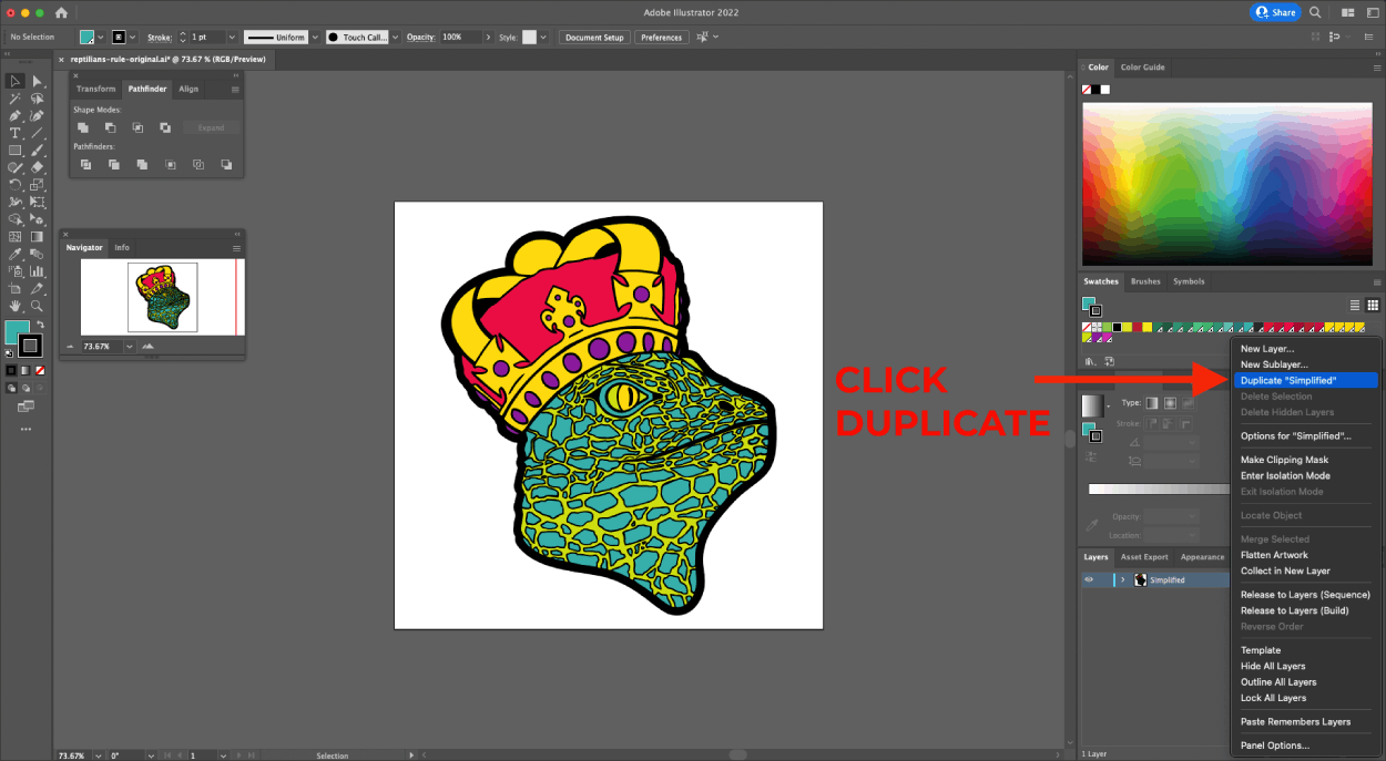
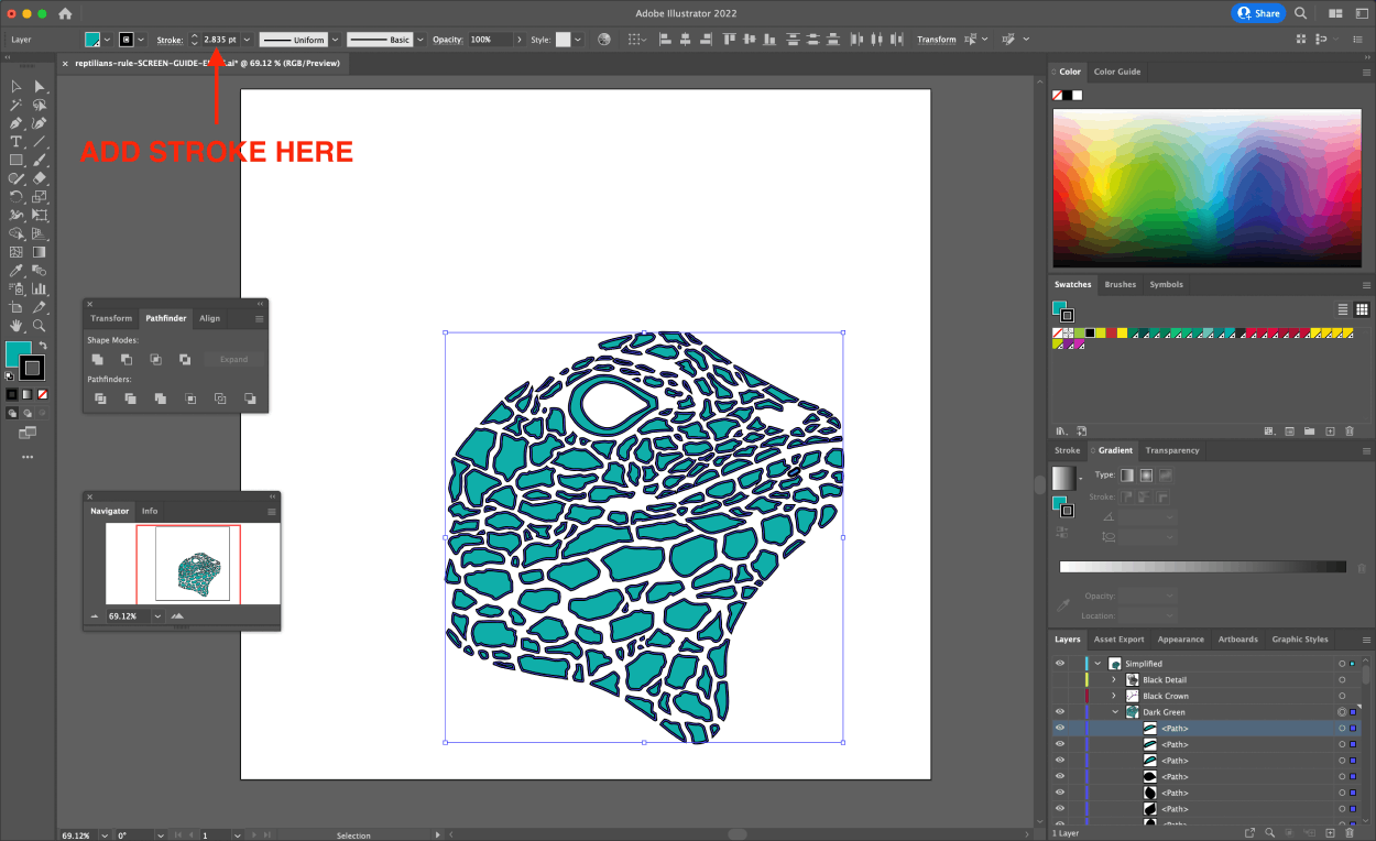
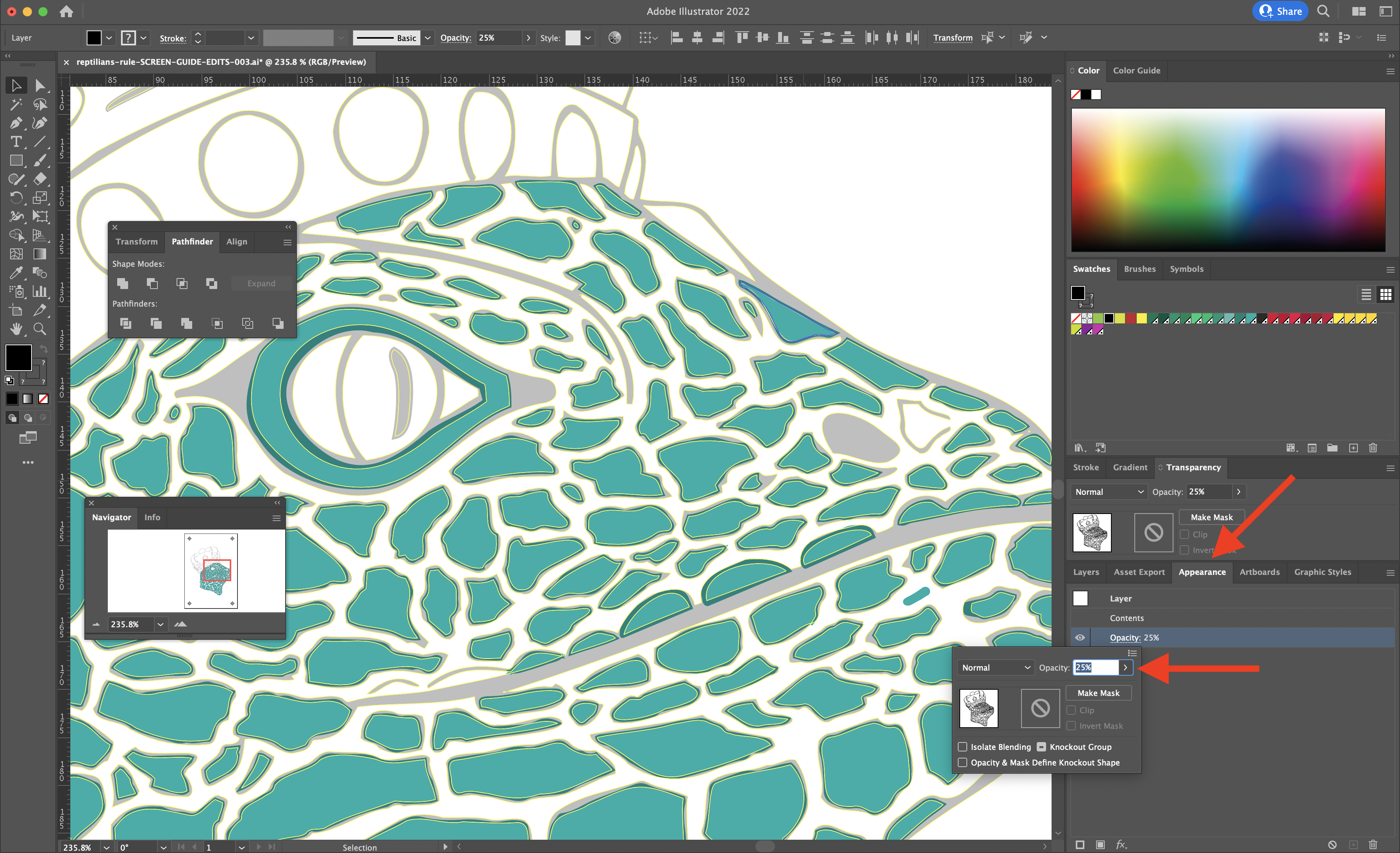
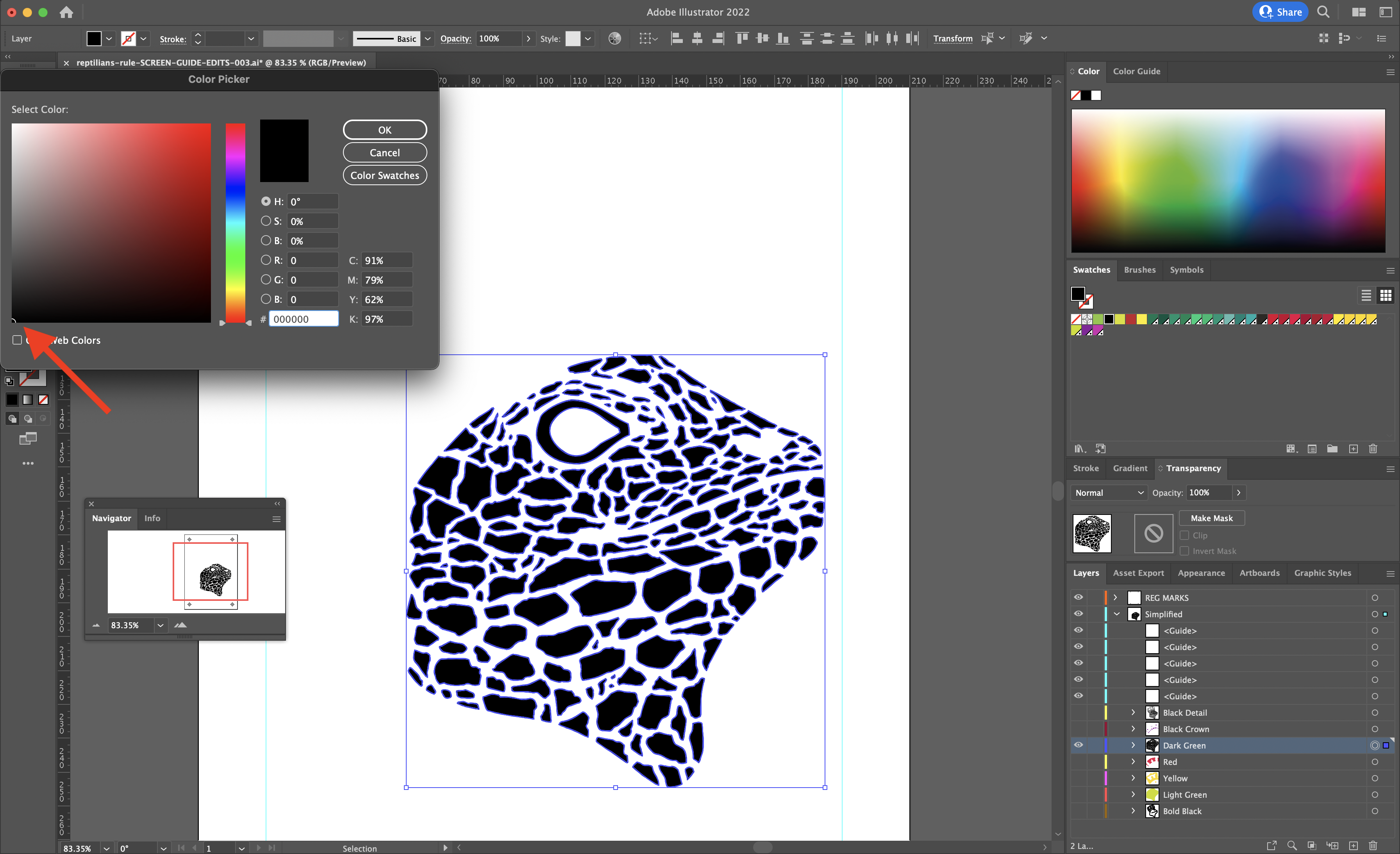
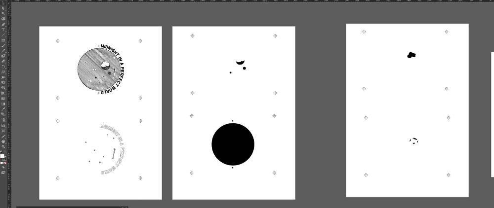
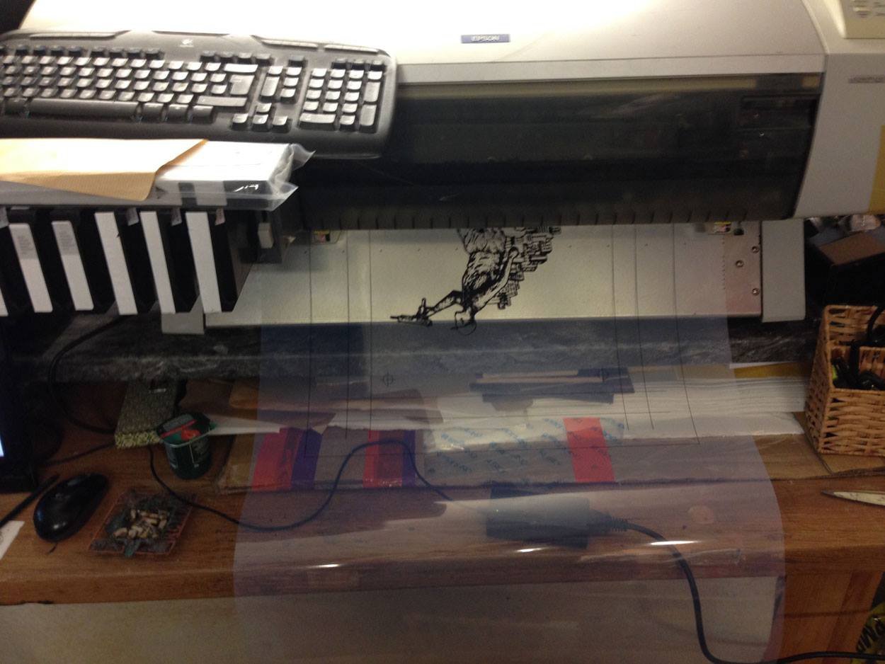
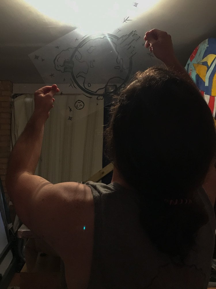
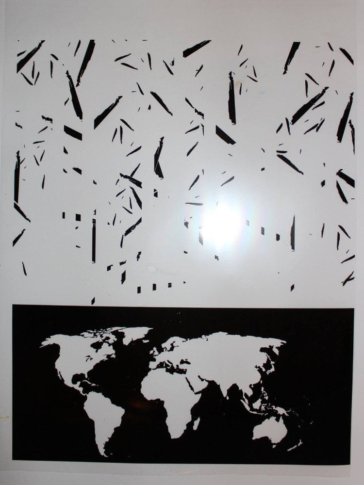
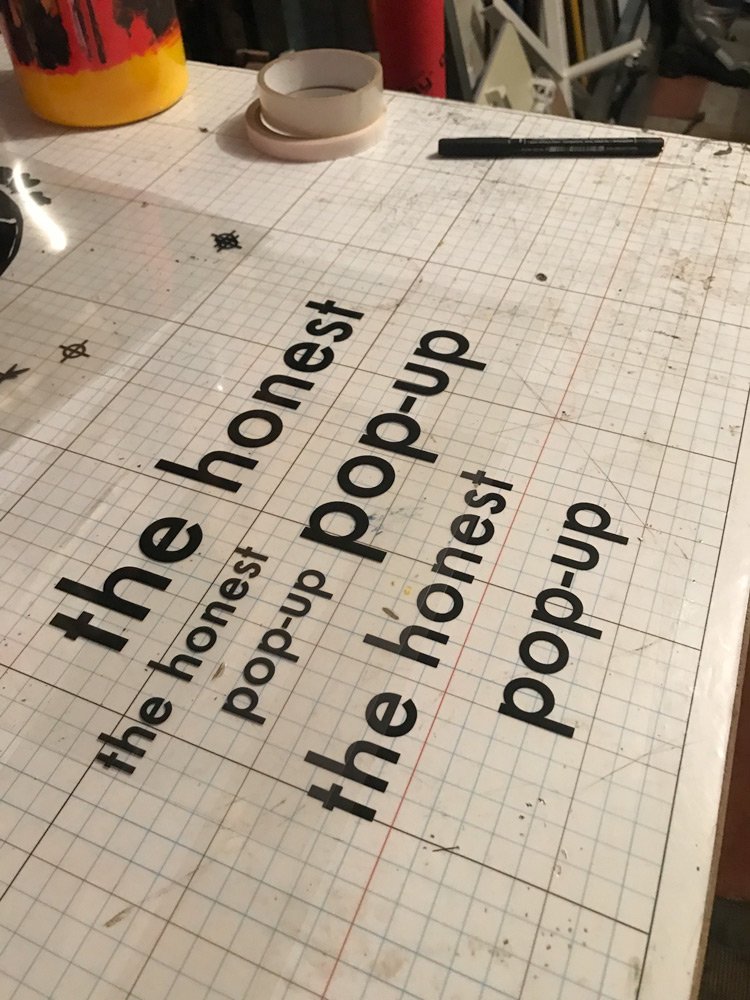
Screen printing is an art form that can be used to create unique and meaningful pieces of art or to print T-Shirts. In order to ensure maximum success in both print quality and design for your artwork, there are some simple steps you should follow when preparing for screen printing.

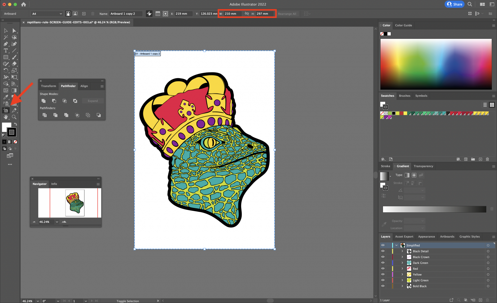
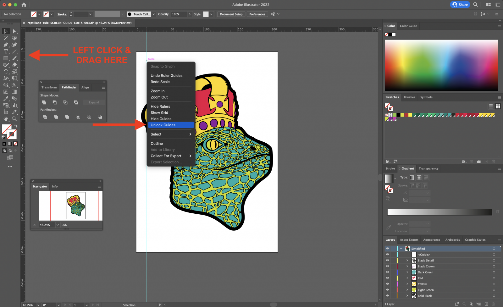
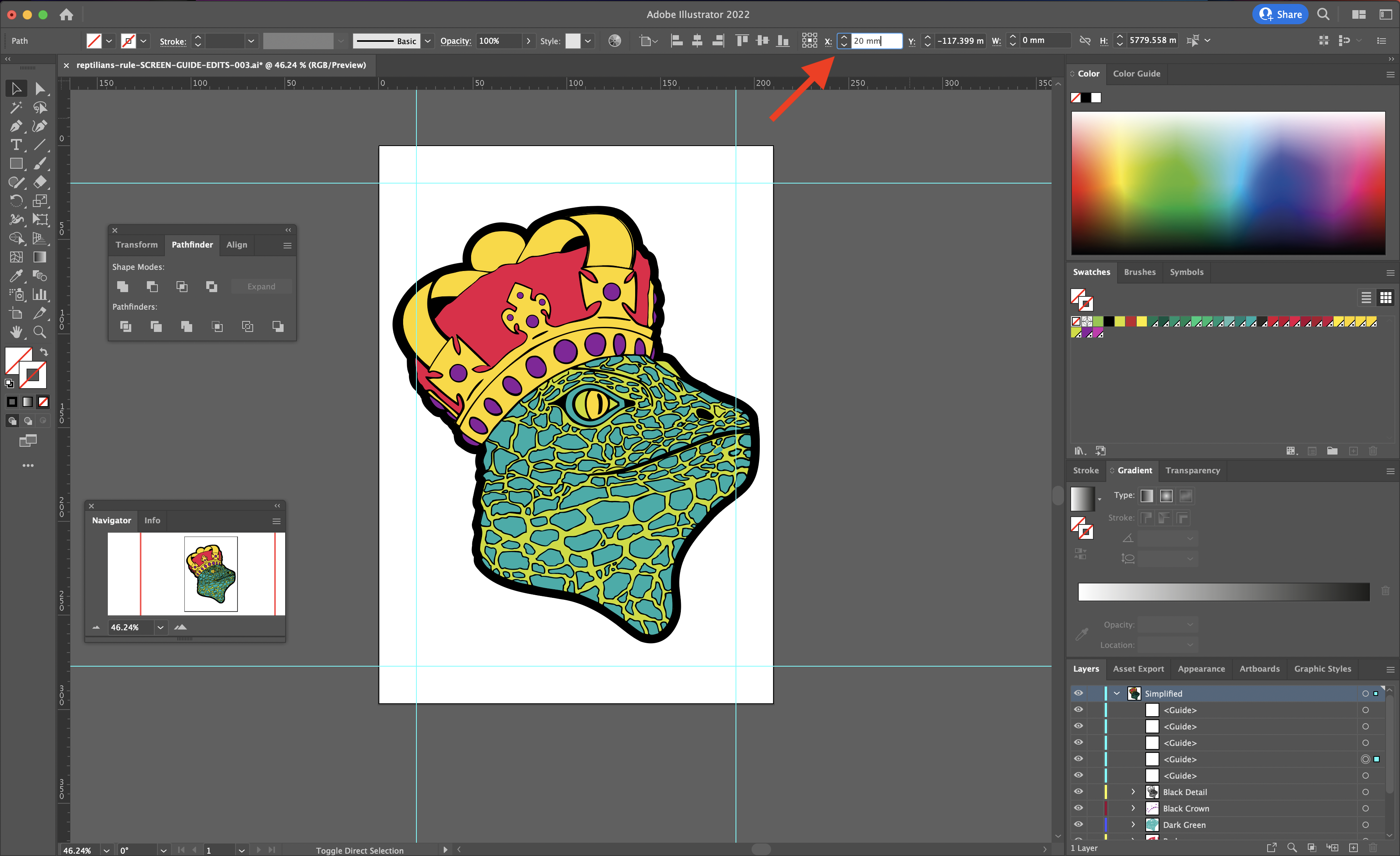
This guide will provide you with all of the necessary information from start to finish so that you can confidently set up your artwork so that it is ready for screen printing. We use Adobe Illustrator in this guide, however you can use a free tool like Photopea. Screen printing can help you express yourself and your ideas in a tangible way by turning them into products that you can sell.

Check out our screen printing process guide after reading this guide

Affiliate Disclosure:Β I only recommend products I would use myself and all opinions expressed here are our own. This post may contain affiliate links that at no additional cost to you, I may earn a small commission when you purchase. These commissions help with the running costs of this website, if you do purchase via one of the product links many thanks it is greatly appreciated!

Luke Hickman

Author at Hickman Design

Luke Hickman is a printmaker and artist with over 15 years of experience. He studied at Norwich University, graduating with a BA (Hons) Fine Art, and has worked in both the commercial printing and digital marketing industries for over 7 years. Luke’s work revolves around the idea of creating art that can illustrate a story with topics covering war, politics and history.

Read Full Bio

Step 1 – Methods for screen printing and setting up artwork

To start with when it comes to screen printing in more than one colour, there are three common techniques to set up artwork out there, known asΒ trapping, knock-out, andΒ overprint.

Trapping Artwork

The trap technique is when we let the edges of the bottom layer (red /pink colour) be partially covered by the top layer (black outline), so that there is no gap between the two layers in case the screen moves and our print gets misaligned or paper shrinking. You can check out this great video on trapping artwork for print. In the image shown the pink (middle line) would be red ink that is printed under the black outline, this allows for slight movement of the screen when printing.

Overprint

Usually when printing on fabric, the overprint technique is used as it is easiest. Each layer gets printed on top of the previous ones, often resulting in a new colour when our top layers are colours that are semi-transparent (e.g. if we print a yellow layer on top of a red one, we get a shade of orange in the overlap). If printing lighter colours on top of dark it will mute the colour like shown, you can print a white layer then the desired colour on top to help keep the colour bright.

Knock-Out

Unlike trapping, the knock-out technique requires us to print the top colours precisely within the gaps we leave in our bottom colour. Because screen printing is normally not so precise, knock-out is not commonly used in commercial screen printing.

Methods To Print Colour Screen Prints

This guide covers using vector artwork and not photos, each have their own methods for setting up artwork to print. We also will only be using spot colours and not CMYK screen printing, with the latter requiring a bit more time to set up the artwork.

I have included some other guides for screen printing images or CMYK prints, which need colours etc set up with halftones check them out below:

Before starting our guide make sure you have your vector artwork ready, if not check ourΒ guide on turning drawings into a vector artworkΒ and then come back to this guide once you have your vector art ready.

The reason we work with vector artwork is so that we can scale and edit artwork without affecting the quality of the design. Rasterized artwork will pixelate and lose details when scaling your design, also they are harder to edit.

Setting Up Your Artboard For Screen Printing

Before you start, find out what size your screen’s printable area is, usually A3 / A4 for T-Shirts and set your artboard to this size so it’s easier to register (line up) the layers (colours) when screen printing later.

The next step is to add your design onto the artboard and resize it to your desired size. Ideally you want to leave a 10 – 30mm gap (depending on how much emulsion covers the screen) around the edge of your artboard, because:

  • You can’t print all the way up to the edge of the screen mesh. When your squeegee prints too close to the edges, the mesh gets tighter near the edge making it difficult to print
  • Your emulsion may not cover all the way up to the edge of the screen mesh and frame. You will find that where there is no emulsion on the edges you will tape over the gaps, this is to stop ink printing through and ruining your design

Changing artboard size.

Using Rulers When Planning Screen Print Design

I usually set up artwork with rulers (CMD + R or CTRL + R) in Adobe Illustrator to help plan the artwork on the artboard. Click and drag from the left guide bar to bring your ruler onto the artboard, right click the guide line and click unlock. This unlocks the guide so that you can add in specific measurements to place the ruler accurately on the artboard. In the top bar you can input specific measurements.

Once your guides have been added with the 10 – 30mm gap (depending on how much emulsion covers the screen) from the edge of the artboard and you have the artboard set to the size of the printable area, make sure to align your artwork vertically and horizontally.

To make life easier when aligning your artwork to your artboard, you can group your layers (CMD + G or CTRL + G) and then align horizontally and vertically. Once you have grouped and aligned you can repeat the previous step and ungroup the layers.

Adding rulers to artboard and unlocking your guides.

Placing guides using measurements.

Step 2 – Registration marks for screen printing

With screen printing registration marks, you can easily align artwork on the substrate, making all of the colours more precise and vibrant. Registration marks make your finished product look so professional, you won’t believe it!

Once you have your design on the artboard you need to add some registration marks. Registration marks will be part of the printed transparencies, I make my own from circles with crosses going through them. Once you have created the registration marks, place them on the intersecting rulers, they will help you line up the layers of your screen print later.

Registration marks placed on intersecting rulers.

Step 3 – Separating colours into layers

The first step is to make a copy of the artwork before proceeding, it will be handy to reference the full colour when printing.

You need to separate the colours of your design into separate layers, 1 for each colour as screen printing prints each colour separately. You can name each layer and number them in the order of print, light (being 1st colour to print) to dark (4th last colour to print) in Adobe Illustrator to help remember which order to print in.

Example of layers named for each colour for ease of use.

The best way to separate colours into layers is to duplicate the layer for the amount of colours you have, so if you have 4 colours, duplicate the artwork 4 times.

Then you will need to remove non relevant parts of the design for each colour / layer. So you will have all black in one layer, blue in one layer, red in one layer etc.

Make sure to keep the layers with the darkest on top and lightest at the bottom. The reason you do this is the black / darker colours will overprint the light and help cover up any gaps in between the layers. If you have 2 colours that overprint, then you may get an effect where the light and dark layers make a slightly muted colour.

Duplicating layer in Adobe Illustrator step 1.

Duplicating layer in Adobe Illustrator step 1.

Duplicating layer in Adobe Illustrator step 2.

Duplicating layer in Adobe Illustrator step 2.

If you want to use shades / shadows you will need to create halftones, you can’t screen print shades unless they are fine dots please check the below guides:

Last point, make sure to copy the registration marks onto every layer.

Step 4 – Creating trap between layers

Trapping when screen printing will reduce the chances of there being gaps between the colours or outline, so is an essential part of the screen printing process. Not to say some small gaps give your design a little artistic flair.

Adding trap to your colour layers first andΒ then your top layer / outline if needed (it’s not always essential for your outline to have trap applied). You may want to either hide your black / outline or put it to the bottom of the list of layers for this part of the process to make it easier to see what parts of your design have the trap added.

Ways to add trap to design for screen printing

This can be done by adding a small amount of stroke either in MM or PT depending on how you set up your artwork.

The black outline shown is the extra stroke, this will be the same colour as your layer but for illustration purposes we coloured it black.

Another method is to use the offset path feature in illustrator by going to:Β Object > Path > Offset Path.

You want to play around with the settings:

  • You only need a small amount likeΒ 1 mm max
  • Set β€œJoins” to β€œMitre” which is a little more accurate than over methods
  • β€œMitre” limit set toΒ 4
  • Tick previewΒ and it will show the changes live on screen

Offset paths have to be tweaked depending on your design.

Make sure to check the layers to see if any parts that have had trap added are inline. Some parts may bulge out, you can either move your anchor points or use the pen tool (N) and draw across the bulging part. Just make sure each layer you add trap to is nice and tidy, you don’t want excessive parts of the light layer printed under your dark layer as it can mute the darker colour.

Checking the trap layers together

You can check the trap on each layer by making the top layer’s opacity lower, this will show the layer below and how much the top layer (low opacity) overlaps. You can lower the opacity of each layer by varying amounts to see them overlaid on top of each other.

The way to change opacity of colours in illustrator is: Window > Appearance > New Window Bottom Right > Opacity > Edit As Needed

If the colours meet, A good rule of thumb is to have your dark layer overlap your lighter layers when planning, in other words make sure the dark colours slightly overlap the lighter colours.

Make sure to check these layers well before the next step and make sure there are no gaps in your print. Make sure to reset the opacity after this step.

Also if you use illustrator you can hover on the paths and it will highlight the path line to show through the top layers.

The black opacity has been lowered (grey) to show the colour underneath, some parts in my design will have to have the paths edited.

Step 5 – Turn all colours to black

When exposing your screen print emulsion you need to make sure your design is fully black, this also includes your colours.

The reason being is the black blocks out the light when exposing screens with emulsion on them. The blacked out area stops the emulsion hardening as it blocks the light, the emulsion reacts to UV light and hardens. Then you wash out the screens, areas not exposed to light wash away leaving your stencil which is then printed through.The exposed area hardens which stops ink from being printed.

Drag the colour swatch picker to the darkest point, this needs to be done for each layer.

Example of artwork layers black and separated.

Example of artwork layers black and separated.

Select each layer and change the colour to absolute black. You can go to your colour picker and make sure the selector is in the blackest corner.

You need to make sure these are no colours.

Hunt The Moon Recommend:

β€œPlease use the following CMYK values – any other combination will not work. C= 75, M = 67, Y = 68, K = 90 ”

Step 6 – Printing screen print transparencies / film positives

You need to make sure your transparencies are dark enough, otherwise you may find the light creeps around the edge of the design, making edges rough and losing fine detailed lines.

Warning:Β Make sure to get films that are designed for your printer type inkjet or laser, otherwise they could melt and break inside your printer!

There are a variety of methods / materials to print your film positives with your design on:

Other bits to note with the type of printer you use that can affect the transparency:

  • Inkjets are a cold process so no shrinkage and you will find inkjet films work with most home printers
  • Toner / laser based heat up the substrate so can cause shrinkage and mess up your registration
  • Inkjets are generally cheaper, but it really depends on the ink you use in the printer, you want to try and get a printer with pigment ink and try to stay away from dye inks

You need to make sure your print settings are set to black and white, if you can increase the black output it should help. Sometimes changing the print settings can help:

  • Use glossy photo paper pre-set as this can help increase the amount of black output
  • Set the DPI to the highest setting 300 DPI minimum
  • Some printers have settings for transparency
  • You can print straight from illustrator or you can export as PDFs and print from these.
  • Sometimes RIP software can be used when printing to help unlock extra settings in your printers

You will need to print each layer by colour separately, so make sure to hide the non relevant layers when printing your stencils.

Epson 7600 wide format printer printing stencil.

Checking density of screen printing film positives

Checking stencils in front of light for black density.

Dense black stencils for screen printing.

You should shine a light through the black part of the transparency to make sure the smallest amount of light shines through, ideally none. A last resort would be to double up the transparencies, however this is wasteful and more costly.

You can always use a professional printer to print your transparencies too.

Other guides on printing printing screen print transparencies:

Always make sure to leave your transparencies to dry for a few minutes.

Step 7 – Check layers match up

Make sure all layers match up using the registration marks in the corners. Sometimes heat can shrink the acetate, also make sure the colours overlap each other like your artwork on screen.

Now you are ready to start theΒ screen printing process, good luck!

Dense screen printing film positives

Checking screen print stencils after printing.

Comments & Notes

Close Menu
Contents