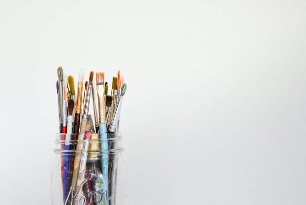
Tone in art is the lightness or darkness of a colour, and it plays a key role in how we see and understand artwork. When we talk about tone, we focus not just on what colours are present, but on how those colours change and interact with light and shadow. Learning about tone helps us see why some pieces grab our attention and guide our eyes across the canvas.
Artists use tone to create depth, mood, and contrast. With the right use of tone, even a simple drawing can feel three-dimensional and full of life. To explore this concept, we can look at how tone works in different mediums and why understanding tone is important for anyone interested in creating or enjoying art.
Table of Contents
Key Takeaways
- Tone is how light or dark a colour appears in art.
- Artists use tone to add depth and mood to their work.
- Understanding tone helps us appreciate and create better art.
Defining Tone in Art
Tone in art means the lightness and darkness of colours. It shapes what we see in an artwork and influences depth, mood, and structure.
What Tone Means in the Artistic Context
When we discuss tone in art, we focus on how colours look from light to dark. Tone differs from hue, which is the name of the colour itself, like red or blue. Instead, tone describes how bright or dull that colour appears.
Artists use different tones to create contrast, highlight important parts, and build a sense of space. Using tone separates objects in an artwork and affects how we feel when we look at it. In some art forms, like drawing or black-and-white photography, tone is the main way artists show changes and differences.
Knowing about tone helps us appreciate why an artist uses certain shades and how those choices shape the artwork’s message or mood. This understanding lets us see the purpose behind the artist’s decisions and how they guide our focus through the piece.
The Role of Lightness and Darkness
Lightness and darkness, sometimes called value, are the two ends of tone in art. Each colour has a wide range of tones, from its darkest to its lightest version. For example, blue can be a pale sky colour or a deep navy tone.
Artists often use tone to make flat shapes look three-dimensional. Adding lighter or darker shades gives volume and depth. This effect is essential in painting and drawing, where shadows and highlights create the illusion of form.
A simple way to see tone in action is to look at black-and-white images. Without colour, we notice the difference in darkness and lightness more clearly, helping us understand structure and space (learn more about lightness and darkness in art). Tone acts as an important building block, organising the elements within the artwork.
How Artists Perceive and Use Tone
Artists rely on their perception of tone to guide their creative choices. They train themselves to see subtle differences between shades, even when colours look similar. This skill helps them make images feel realistic or dramatic.
Artists often create a “tonal value scale,” a series of steps from white to black. This tool helps them plan out where the darkest shadows and brightest highlights will go in the piece. Artists may blend tones softly for smooth surfaces or use sharp changes for a more graphic effect.
In some styles, such as chiaroscuro, the contrast between dark and light becomes the focus of the artwork (learn about tonal contrast methods). By adjusting tone, artists communicate depth, emotion, and emphasis, affecting how we interact with and understand their work.
Elements of Tone
Tone in art gives depth, shows detail, and shapes how we see objects. By focusing on how shades, contrast, and lighting work together, we bring drawings and paintings to life using both colour and black and white.
Shades and Tonal Values
Shades and tonal values describe how light or dark a colour appears. When we talk about shades, we mean the darker versions of a colour—created by adding black. Tonal value describes this scale from the lightest to the darkest version of a colour.
A strong range of tonal values helps us show the form and three-dimensional qualities in our work. For example, a round object can look flat without both light and dark areas. By blending various shades, we create soft transitions. Using only a few tones makes an image look graphic and simple.
Artists often practice creating a tonal scale—a list or a table—moving from white to black with different greys in between. Here’s a simple table for visualising tonal values:
| Tone Name | Tone Example |
|---|---|
| White | ⚪ |
| Light Grey | 🌫️ |
| Medium Grey | ⚫️⚪ |
| Dark Grey | 🌑 |
| Black | ⚫ |
When we use more shades, our art looks more realistic and detailed.
Contrast and Tonal Contrast
Contrast in art is the difference between the lightest and darkest parts of an image. Tonal contrast is how these differences in tone (not colour) work together in black and white or colour art.
High tonal contrast grabs attention and makes certain areas stand out. For example, a bright light next to a shadow draws the eye. It can add drama or make objects look as if they pop out from the background.
Low tonal contrast features gentle shifts between tones, making images feel calm or soft. Some artists use a mix of high and low contrast to guide where we look or to set the mood. Good use of tonal contrast also makes patterns or details easier to see. To understand more, Rise Art explains tone as the relative lightness or darkness in art.
The Impact of Light and Shadows
Light and shadows play a key role in creating tone. When we see how light falls on an object, we notice where it is brighter and where shadows form. These changes give a sense of depth and space, making our images look three-dimensional.
Placing a strong light source, like sunlight, on one side of an object creates highlights and deep shadows. This gives a full range of tones from light to dark. Soft lighting creates less contrast and gentler shadows, which affects how dramatic or lifelike our artwork appears.
Using tone to show light and shadows lets us describe texture, direction, and size. In both black and white and colour, these changes help separate objects and make them feel more real. As described by Arty Factory, tone is used to suggest form or create atmosphere.
Tone and Composition
Tone guides the viewer’s eye through a piece. It helps us show where objects sit in space and makes our artwork look more realistic.
Creating Depth and Distance
We use tone to create depth and show the distance between objects in a composition. Objects in the foreground often have stronger contrasts and darker tones. This makes them stand out to the viewer.
As objects move into the background, we add lighter, softer tones. This technique, called atmospheric perspective, helps objects look farther away. It also makes the space in the artwork feel bigger and more open.
Mountains, for example, look lighter and less detailed as they get farther away. By shifting our tones from dark in the foreground to light in the background, we create a convincing sense of depth. This method is widely used because it’s effective and easy to spot in many paintings and drawings. For more explanation, we can read about how different tones impact composition in art.
Using Tone for Form and Shape
Tone helps us show the form and shape of objects. Adding a range of tones between light and dark gives our drawings a three-dimensional look. We call this the illusion of form.
We control light and shadow by using different tones to suggest where a surface curves or how it’s lit. For example, a round object like an apple might have a bright highlight, a middle area with softer tones, and a shadowed side. These changes help the viewer understand the shape without needing strong outlines.
Moody or dramatic effects appear when we play with the balance of light and dark areas. Artists rely on tone rather than just colour or lines to describe the way light falls on a subject. This approach brings out texture and makes the illusion stronger. Learn more at this guide to tone in art.
Tone in Different Mediums
Tone changes depending on the medium we use. Techniques, materials, and subjects all influence how we create light and dark values, and each medium uses tone in its own way.
Tone in Drawings
When we create drawings, we use pencils, charcoal, or ink to build tone. We adjust the pressure or layering to produce a range of lights and darks, from solid blacks to the faintest greys.
Tonal studies help us understand how light hits a subject. By practising with simple shapes, like a sphere, we see the areas of highlight and shadow. This helps us develop the ability to create realistic images.
Cross-hatching, blending, and stippling are common techniques for controlling tone in drawings. By changing the spacing and direction of our marks, we can suggest texture and depth. If we master tone, our line work becomes much more believable and expressive. You can explore more about how artists use tone in drawing from this art coursework guide.
Tone in Painting
In painting, we achieve tone by mixing lighter and darker versions of a colour. We often use white to lighten a colour or black and other dark colours to deepen it. Oil, watercolour, and acrylic paints all allow for blending soft transitions of tone, which is essential for creating smooth surfaces or realistic forms.
Painters rely on tone to make objects appear three-dimensional on a flat canvas. For example, we might paint a still life using a range of tones to show the curve of an apple or the depth of a shadow behind a vase. Tonal studies help us plan our paintings by focusing on values before thinking about colour. More on how tone works in painting can be found in this guide about tone in art.
Tone in Still Life Artworks
When we work with still life artworks, tone gives everyday objects form and weight. Using light and dark values, we can make a flat drawing look three-dimensional.
A good still life often starts with a quick tonal study to mark out areas of shade and light. This helps us place highlights on fruit, glass, or fabric, making them stand out from the background. Attention to tone can also bring mood into our still life pieces, letting us control how dramatic or calm the finished artwork appears.
Practising with simple objects, such as a sphere or cube, builds our ability to see and reproduce tonal changes accurately. By studying how light falls on different surfaces, we create more lifelike still life art. Learn more about the role of tone in composition from this breakdown of tone in art.
Tonal Techniques and Methods
Different approaches to tone help us create depth, show emotion, and add drama to our artwork. By using specific techniques, we can guide the viewer’s eye and bring our images to life in unique ways.
Chiaroscuro and Classic Approaches
Chiaroscuro uses strong contrasts between light and dark. Artists like Caravaggio added depth and realism with this method. Dark shadows and bright highlights draw attention to the most important parts of a painting. This method is key in classical art, especially during the Renaissance and Baroque periods.
We use pencils, charcoal, or paint to practise this approach. By slowly building up layers of shade, we achieve a smooth transition from light to dark. This technique gives forms a three-dimensional feel and helps figures stand out from their background. Classic tonal drawing often uses black, white, and a range of grey tones to show a full spectrum of values, making the image rich and realistic. For more about tonal drawing practices, visit this detailed guide from Tate.
Modern Exploration of Tonal Variation
Contemporary artists experiment with tone in new and creative ways. Today, we see a wider range of colours used to make tonal changes, not just black, white, and grey. Artists may use only one colour with lighter or darker shades, or multiple colours with different tones blended together. This adds visual interest and freshness to modern art.
Some artists use bold, clear shifts between tones, while others layer marks to blend softly. Techniques such as cross-hatching, stippling, or even digital tools let us play with how we apply tone. These methods help us explore tone beyond traditional methods, embracing both subtle shifts and striking contrasts. As explained on Rise Art, any colour can have shades from very light to very dark, offering us unlimited creative options.
Building Rhythm and Expressive Character
Tone does more than describe how light or dark something is; it helps us set rhythm and mood in an artwork. Rhythm comes from repeating tones or switching rapidly between light and dark in patterns. This can make a work feel calm and even or full of movement and surprise, depending on our choices.
We use tone to express character and mood. For example, dramatic lighting with sharp contrasts gives energy and intensity, while gentle gradations suggest softness or quietness. By controlling shifts in tone, we lead the viewer’s eye, highlight important shapes, and create atmosphere. Simple tonal techniques like layering and mark-making are practical tools for this. Our choices in rhythm and expressiveness give tone its real power as a tool for meaning and emotion in art.
Practical Aspects of Working With Tone
When working with tone in art, we need to think about how texture and pigment affect the look of a piece, how to control the intensity and luminosity of colours, and how highlights interact with more dull or shaded areas. Paying attention to these factors helps us build depth, contrast, and interest in our artwork.
Using Texture and Pigment
Texture plays a big role in how we see tone. When we use thick paint, rough paper, or mix media, we can change how light and shadow read on the surface. A rough canvas scatters light, which can soften strong darks and make lights seem less bright.
Pigment type also matters. Some pigments give a richer, deeper tone. Others are naturally soft or chalky. By blending and layering, we can get smooth tone changes, or keep them rough to add energy. We often use simple tools like a dry brush or cloth to blend out hard edges, making changes in tone look natural.
Changing the amount of pigment lets us go from soft, light tones to darker, more intense ones. When we layer watercolour, each layer adds a bit more darkness. Charcoal and pastels can be smudged and blended to test different textures and tones.
Adjusting Intensity and Luminosity
Intensity is how vivid a tone is. Luminosity means how much light a colour seems to have. To adjust intensity, we may mix the original colour with its complementary hue, with grey, or with white, which can dial down its strength without losing depth.
Working in layers helps us control luminosity. Thin washes of paint can let paper shine through, making the colour look brighter. Thick, opaque layers can dampen luminosity, so adding and removing paint carefully lets us strike the balance we want.
Here is a simple list for handling intensity and luminosity:
- Mix with grey to tone down intensity.
- Add water for see-through, luminous colour.
- Use thicker paint for solid, less luminous passages.
- Build up in thin glazes for glowy, light-filled effects.
Balancing Highlights and Dull Areas
Getting a good balance between highlights and dull spots brings energy to our work. Highlights use brighter, lighter tones. Dull areas use reduced intensity and darker values to hold the composition together.
Placing highlights in the right places pulls attention. If everything is too bright, nothing stands out. If a painting is too dull, it may seem flat or lifeless.
We create contrast by:
- Saving our brightest and most intense tones for focal points.
- Using muted tones in background and shadow areas.
- Softening edges in dull zones to let highlights pop.
Using tone like this gives our artwork structure and guides the viewer’s eye across the composition. For more on how artists handle tone, see the explanation on tone and contrast from BBC Bitesize.
The Importance of Tone in Visual Perception
Tone shapes how we see art by helping us notice depth, mood, and three-dimensional forms. It guides our eyes across a piece and lets us experience the intended emotion or focus.
Enhancing Atmosphere With Tonality
Tone plays a key role in setting the mood of an artwork. By adjusting the lightness or darkness of colours, artists can create a scene that feels calm, tense, mysterious, or bright. For example, a landscape with soft, muted tones may feel peaceful, while harsh contrasts can make a scene feel dramatic.
Tonality—a range of tones used throughout a piece—lets us identify what time of day it is or even the weather. Subtle shifts from light to dark help create a specific atmosphere and affect how we react to an image. For more about how mood is affected by tone, see the BBC’s guide on tone in art and design.
Artists use high contrast tones to select a focal point or to build emotion. Low contrast, with gentle tonal changes, often makes a piece feel softer or more subdued.
Creating Illusions in Art
Tone is essential for building the illusion of form and space. By using different tones, we create the appearance of highlights, shadows, and mid-tones on objects. This tricks the eye into seeing a three-dimensional shape on a flat surface.
We rely on tone to understand where light is coming from in a picture and to sense how close or far away objects appear. Even in simple sketches, tone allows round shapes to look full and solid rather than flat.
Artists may use a tonal scale—ranging from pure white to deep black—to give depth and structure. Careful control of tonal value lets us distinguish foreground from background, helping to create the illusion of distance. For details about how tone achieves these effects, visit this overview on tone’s role in art composition.
Frequently Asked Questions
Tone is one of the most important elements in creating visual depth and contrast in art. It helps us see form, mood, and structure, and allows artists to guide the viewer’s eye through a piece.
How can tone be defined in the context of artwork?
We define tone in art as the lightness or darkness of a colour or area in a picture. It lets us show shadows, highlights, and mid-tones. Each colour can have a wide range of tones, not just one fixed value.
In what ways do artists use tone to enhance their drawings?
Artists use tone to add depth and create a three-dimensional effect on a flat surface. Changes in tone help to describe shape, distance, and where light falls. By carefully placing light and dark areas, we can direct attention and build mood.
What role does tone play in the composition of a painting?
Tone is crucial for building composition. It lets us create contrast, balance, and harmony between different parts of a painting. Strong tonal contrast can highlight important elements, while soft shifts in tone can make scenes calming or mysterious.
How does tone differ from shade when discussing visual arts?
Tone means how light or dark a colour appears overall. It is not the same as shade, which often refers to a colour made darker by adding black, or to a dark area made by blocking light. Multiple shades can still share the same tone if their darkness is similar.
Can you explain the significance of tone in art appreciation?
Understanding tone helps us notice details that might be missed, like subtle shadows and highlights. It also lets us see how artists use contrast and depth, making it easier to judge the skills and choices in a piece. Tone influences mood and emotional impact in both abstract and realistic works.
What techniques are involved in creating different tones through shading?
We use techniques like hatching, cross-hatching, and blending to create different tones. Pressing harder or softer with a pencil, using various brushes, or layering colors controls tone on paper or canvas. These methods suggest light, shadow, and form.