
Welcome, dear reader, to our detailed exploration of the fundamental principles of colour theory. This discipline, at its core, studies how colours relate to one another and how they can be combined to create a specific reaction or emotion. As you might have observed in the natural world, certain colour combinations are particularly pleasing to the eye, while others are jarring. This isn’t random happenstance; it’s the outcome of centuries of scientific and artistic exploration into the very heart of the colour spectrum.
The journey we’re about to embark on will lead us through the labyrinthine complexities of the colour wheel, primary, secondary, and tertiary colours, warm and cool colours, complementary colours, analogous colours, colour harmony, and colour context.
Table of Contents
The Colour Wheel
At the core of colour theory is the colour wheel, a circular diagram that represents the relationships between colours. Originally proposed by Sir Isaac Newton in 1666, the colour wheel has proven an indispensable tool in understanding the complex interrelationships between different hues.
Sections of The Colour Wheel
As we set off to explore the vibrant and captivating world of colour theory, our first stop is the core of it all—the colour wheel. This circular representation of colour relationships is home to a symphony of hues derived from the foundational trio of primary colours: red, blue, and yellow. This basic triad spawns a cascade of secondary and tertiary colours, each carrying their own unique blend of the original triumvirate. Thus, from these three unadulterated roots, we traverse through an enchanting array of shades, each resonating with its own tonal harmony and identity.
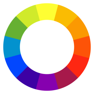
Source: Wikimedia
- Primary Colours: At the root of the colour wheel are the three primary colours – red, blue, and yellow. These are the foundation upon which all other colours are built. They cannot be created by mixing other colours. Imagine these as the raw, primal parents from which all other hues are birthed.
- Secondary Colours: Just as biological reproduction results in offspring, the intermingling of primary colours produces secondary colours. When you mix two primary colours, you get secondary colours—green (blue and yellow), orange (red and yellow), and purple (red and blue). These secondary colours reside on the colour wheel between the two primary colours that create them.
- Tertiary Colours: The complexity doesn’t stop there. Further blending of primary and secondary colours gives rise to tertiary colours. These include red-orange, yellow-orange, yellow-green, blue-green, blue-violet, and red-violet. They sit on the colour wheel between a primary and secondary colour.
Warm and Cool Colours
Once we have a fundamental understanding of the colour wheel and how it operates, we can delve into the concepts of warm and cool colours.
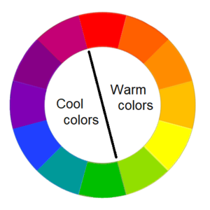
Source: Wikimedia
- Warm Colours: On one half of the colour wheel, we have the warm colours. These include reds, oranges, and yellows. Just like the warming rays of the sun or a cosy flame, warm colours evoke feelings of warmth, comfort, passion, and energy.
- Cool Colours: Opposite to the warm colours are the cool colours. These hues—blues, greens, and violets—remind us of the refreshing coolness of water, the tranquil serenity of a forest, or the vast expanse of the sky. They generally bring about feelings of calmness, relaxation, and refreshment.
Complementary, Analogous, and Monochromatic Colours
With the colour wheel as our compass and a deeper understanding of warm and cool colours, let us journey into the realm of complementary, analogous, and monochromatic colours.
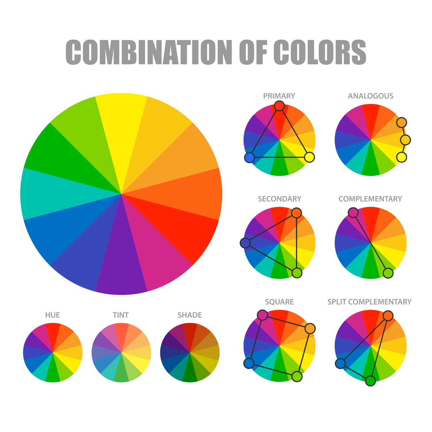
Image by macrovector on Freepik
- Complementary Colours: Complementary colours are located directly across from each other on the colour wheel. Think red and green, blue and orange, yellow and purple. When juxtaposed, these colours create a vibrant contrast, stimulating the eye and making each colour appear more vivid.
- Analogous Colours: On the other hand, analogous colours are those that sit next to each other on the colour wheel, such as red, red-orange, and orange. This group of colours works harmoniously together, creating a sense of unity and calmness.
- Monochromatic Colours: A monochromatic colour scheme, as the name suggests, involves a single hue. By adjusting the brightness or saturation of the chosen colour, a range of shades, tints, and tones are created. This scheme is elegant and straightforward, offering depth through the exploration of a single colour.
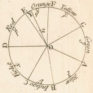
Johannes Itten and His Colour Wheel
Johannes Itten, a renowned Swiss artist and educator, made substantial contributions to modern colour theory. His work forms the foundation of colour education in art and design schools worldwide. One of his most significant contributions was the development of his own version of the colour wheel, known as “Itten’s Colour Wheel.”
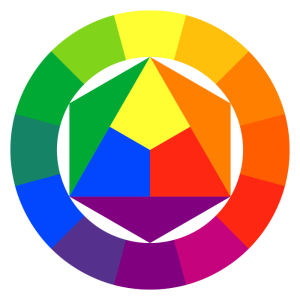
Source: Wikimedia
What is Itten’s Colour Wheel?
Itten’s Colour Wheel differs from the traditional model. Instead of using only three primary colours—red, yellow, and blue—Itten’s wheel incorporates twelve hues. His primary colours are still red, yellow, and blue. However, his secondary colours, produced by mixing these primaries, are green, orange, and violet, while the tertiary colours are yellow-orange, red-orange, red-violet, blue-violet, blue-green, and yellow-green.
These colours are situated on the wheel based on their relationships and how they are derived from the primary colours. Itten’s Colour Wheel is unique because it places an equal emphasis on both the artistic and the scientific understanding of colour.
How Itten’s Color Wheel Works
- Primary Colours:
- Itten’s Colour Wheel identifies three primary colours: red, yellow, and blue.
- These primary colours are considered the core colours that cannot be created by mixing other hues.
- Secondary Colours:
- Secondary colours on Itten’s Colour Wheel are formed by mixing two primary colours.
- The secondary colours are green (formed by mixing blue and yellow), orange (formed by mixing yellow and red), and violet (formed by mixing red and blue).
- Tertiary Colours:
- Tertiary colours on Itten’s Colour Wheel are created by combining a primary colour with its adjacent secondary colour.
- The resulting six tertiary colours are red-orange, yellow-orange, yellow-green, blue-green, blue-violet, and red-violet.
- Warm and Cool Colours:
- The colour wheel is divided into warm and cool colours.
- Warm colours include hues from red-violet to yellow, encompassing reds, oranges, and yellows, which evoke sensations of warmth, energy, and passion.
- Cool colours span from violet to green, encompassing violets, blues, and greens, which evoke sensations of calm, tranquillity, and freshness.
- Complementary Colours:
- Complementary colours on Itten’s Colour Wheel are directly opposite each other on the wheel.
- When used together, they create dynamic and high-contrast combinations, causing each colour to appear more vibrant.
- Contrasts:
- Itten proposed seven types of contrasts to understand how colours work together.
- These contrasts include hue, light-dark, cool-warm, complementary, simultaneous, saturation, and extension, each providing different ways to create harmony and balance in a composition.
Understanding Itten’s Colour Wheel is not merely about knowing where a colour sits on the wheel; it’s about understanding the relationships and contrasts between different colours and how they work together to create harmony, balance, and visual interest.
The Significance of Itten’s Colour Wheel
Itten’s Colour Wheel isn’t just about colour relationships—it’s about harmony. Itten believed that harmony in art is best achieved when colours maintain a balanced relationship with each other. He expanded upon traditional colour theory by introducing seven different ‘colour contrasts,’ ways in which colours could be methodically paired for the most harmonious effect. These include:
- Contrast of Hue: The simplest form of contrast, created by using colours of differing hues.
- Light-Dark Contrast: A contrast between light and dark colours, not limited to black and white.
- Cool-Warm Contrast: A contrast between colours deemed as ‘warm’ (like red, orange, and yellow) and ‘cool’ (such as blue, green, and violet).
- Complementary Contrast: Using colours that are directly opposite each other on the colour wheel.
- Simultaneous Contrast: This occurs when the eye simultaneously tries to compensate for a colour by creating its complementary colour.
- Contrast of Saturation: A contrast between pure, intense colours and dull, diluted colours.
- Contrast of Extension: Also known as contrast of proportion, this involves the balance of colours in proportion to their intensity and area.
The Influence of Itten’s Colour Wheel
Itten’s Colour Wheel and his theories of colour contrasts had a profound impact on how artists and designers understand and use colour. By comprehensively explaining the relationships and interactions between different colours, he provided tools that can help artists create more visually harmonious and engaging works.
To summarise, Itten’s Colour Wheel isn’t merely a variant of the traditional colour wheel; it’s a testament to Itten’s exhaustive study of colour and his desire to help others understand the profound power of colour relationships and contrasts in creating harmonious and impactful art.
Colour Harmony
The concept of colour harmony emerges from the strategic arrangement of colours. Harmonious colours produce a pleasing aesthetic experience. To achieve harmony, one could utilise a complementary colour scheme for a lively, dynamic effect, an analogous colour scheme for a peaceful, serene atmosphere, or a monochromatic scheme for a sophisticated, single-hue environment. Each approach generates a different kind of harmony, but all aim to avoid visual chaos and instead invite viewers into an aesthetically pleasing world.
The practical value of color theory is fully demonstrated in Custom Neon Signs design. With their unique interplay of light and shadow, custom neon signs have become a popular choice for commercial space decoration, creating a home ambiance, and showcasing brand identity. Color theory is the core principle that makes their visual effects so captivating.
Colour Context
Lastly, we must understand that colours don’t exist in isolation. They’re influenced by the colours around them—a phenomenon referred to as colour context. A colour can appear drastically different depending on the colours surrounding it, even though it hasn’t changed. For instance, a mid-grey colour might appear darker against a white background but lighter against a black background.
This plays into the broader psychological and cultural connotations of colours, where colours can have vastly different meanings and evoke different emotions depending on the context. For instance, while red often symbolises passion and love, it can also signify danger or urgency in other contexts.
Conclusion
Colour theory is not a rigid science but a flexible field that provides guidelines to help us understand and use colour effectively. It is an essential tool for artists, designers, and marketers alike. With this comprehensive understanding, you now hold the power to create compelling, visually engaging designs that will inspire, move, and influence those who view them. So, don’t be afraid to experiment, play around with different combinations, and remember—colour is a language all its own. Use it to tell your story.
Other Colour Theory Resources


