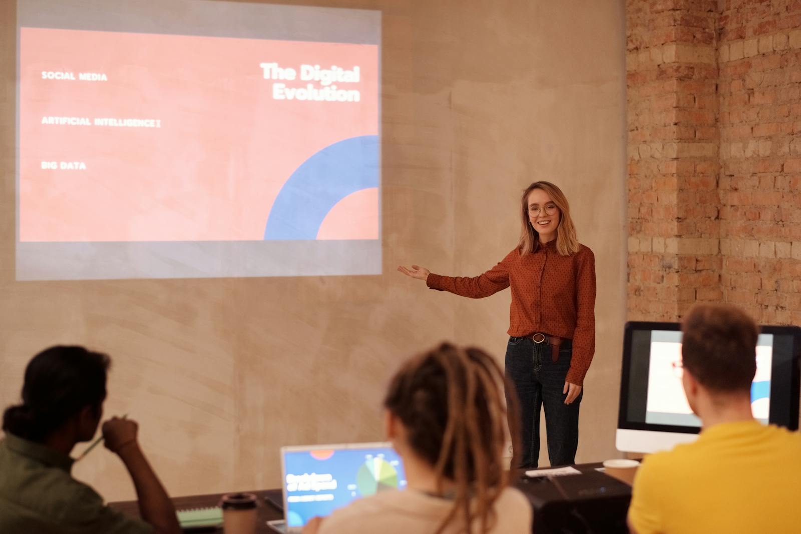
PowerPoint as a presentation platform is often misunderstood and underrated, with many of its features not utilised for the best results. In many organisations, it is seen as the place where good ideas slowly lose their unique design sparkle due to default templates, overcrowded bullet points and old school font options
That reputation says far more about the “part time” designer than it does about PowerPoint as a design tool. In our opinion a PowerPoint presentation can absolutely be beautiful and effective, and here’s why…
Table of Contents
What “beautiful” really means in presentation design
Before judging any design tool, it helps to agree on the standard. A beautiful presentation is not simply one filled with large images and fashionable gradients. In practice, strong presentation design usually comes down to a few fundamentals.
There is clear visual hierarchy, so the audience immediately understands what matters most. Typography is handled with care, with consistent font choices, sensible line spacing, and readable scale. Layouts are built on a grid, so everything aligns cleanly and predictably. Slides breathe, with enough white space to create pace and rhythm. The deck feels consistent from start to finish, with brand elements and spacing behaving as expected. Motion, where it is used, supports meaning rather than distracting from it.
PowerPoint is not a full creative suite like InDesign or After Effects, and it does not try to be. If the goal is communication that needs to travel well inside an organisation, its strengths begin to look less like compromises and more like deliberate design decisions.
Typography that works when you think like a typographer
PowerPoint offers more typographic control than it is often given credit for, and less than designers sometimes wish it had.
On the plus side, it supports professional font use in a way that makes sense for businesses. Fonts can be embedded so presentations are less likely to fall apart when shared, which is essential for maintaining brand consistency across devices and teams.
Where PowerPoint falls short is in fine detail. You will not find deep kerning controls, optical margin alignment, or advanced typographic features presented in a designer first interface. The route to good looking typography is not obsessing over microscopic details, but creating a clear, repeatable system that PowerPoint can enforce.
That usually means defining a small set of text styles for titles, section headers, body copy, and captions. It means setting clear rules for line length and spacing. It means using proper paragraph spacing instead of manual line breaks. And it means choosing emphasis deliberately through weight, colour, or scale, rather than underlining everything in sight.
PowerPoint will not fix weak typography for you. But once a strong system is in place, it will reproduce it faithfully and consistently.
Layout and grid systems where PowerPoint becomes a real design tool
If you design every slide individually, PowerPoint can feel awkward and restrictive. The moment you start designing in Slide Master, it changes character.
Slide Master exists to create consistency. Colours, fonts, headings, logos, and layout rules are defined once and applied everywhere. This is exactly what designers want when they are building structure rather than decorating individual slides.
This is also where PowerPoint becomes genuinely powerful for organisations. A well built master is not just a time saver. It is brand governance built into the file. It reduces layout drift, discourages casual adjustments that break alignment, and creates guardrails that allow non designers to produce acceptable work.
From a design point of view, Slide Master enables consistent grids, modular layouts, predictable spacing, and fast iteration. Changes made once can ripple through an entire deck. The result is not just better looking slides, but slides that scale. In many businesses, that difference is what separates one strong presentation from a culture of consistently strong presentations.
Visual assets that hold up better than expected
Images, icons, and charts play a huge role in how designed a presentation feels. PowerPoint handles these more capably than many people realise.
One of the most meaningful improvements in recent years has been reliable support for scalable vector graphics. SVG files allow icons and illustrations to stay sharp at any size, and in modern versions of PowerPoint they can be edited directly rather than treated as static images.
Clean icon systems become viable. Visuals can be recoloured to match brand palettes. Artwork can scale without losing quality. A consistent visual language becomes much easier to maintain.
Imagery more broadly still requires discipline. PowerPoint will happily let you stretch, crop, and compress images into something unattractive if you let it. But with consistent assets and a clear layout system, it will execute your visual direction reliably.
Motion and transitions that elevate rather than distract
Motion is one of the areas where PowerPoint often surprises people. The Morph transition, in particular, allows objects to animate smoothly from one slide to the next without complex builds.
Used thoughtfully, this can transform a deck. Diagrams can assemble step by step. Zooms can move an audience through a system or process. Before and after comparisons can flow rather than jump. Timelines can advance with continuity instead of resetting each time.
Used carelessly, motion becomes noise. The best presentation movement is subtle and purposeful. It clarifies relationships and supports the speaker rather than stealing attention.
Collaboration that reflects how work actually gets done
Designers often judge tools by creative freedom alone. Businesses judge them by whether teams can realistically ship work together.
PowerPoint allows multiple people to work in the same file at the same time when used with shared storage. Most real presentations are negotiated, edited under pressure, and revised repeatedly until the final hour. Collaboration is not optional.
This is where we want to introduce you to the idea of using a PowerPoint (PPT) design Expert. Yes, professional agencies that specialise in a “done for you” presentation design service really do exist. Often helping with all of the heavy lifting and delivering a PPT presentation that doesn’t only look beautiful but displays data clearly and delivers that kick *ss impact you really need.
Accessibility as part of good design
A presentation can look elegant and still exclude people if contrast is weak, reading order is confusing, or images lack context.
PowerPoint includes built in accessibility tools that help identify common issues. Accessible design often results in clearer slides overall. Stronger hierarchy. Better contrast. More intentional structure.
Beauty and usability are not opposites. The most thoughtful presentation design treats them as inseparable.
AI assisted building and the rise of systems thinking
PowerPoint is increasingly positioned as a tool that helps people build faster while respecting template rules and brand guidelines.
New AI driven features can assist with rewriting text, formatting slides, inserting visuals, and creating new layouts within an established framework. That shift matters. It moves PowerPoint away from being a blank canvas and towards being a structured production environment.
Of course, AI will only be as good as the system it works within. A weak template produces weak slides more efficiently. A strong master produces consistent, on-brand output at scale.
Where PowerPoint still has limits
PowerPoint is not flawless. Advanced illustration is possible but rarely enjoyable. Fine typographic control is limited. Complex motion design has a ceiling. Templates can be misused without clear governance.
These limits simply define what PowerPoint is built for. It excels at presentation communication. It is not designed to replace every creative tool.
So just how good is it?
PowerPoint is far better than its reputation suggests, particularly when used with discipline.
It may not be the most expressive design canvas available. But as a platform for producing beautiful, consistent presentations under real business constraints, it is remarkably capable. Its strength lies in structure, scalability, collaboration, and clarity.
PowerPoint will not turn someone into a designer overnight. But it will reward those who approach it with intention, systems thinking, and respect for the craft.
And that is precisely why it continues to hold its place as one of the most practical tools for creating presentations that look genuinely polished and work in the real world.