Mood boards have defined interior presentation for decades. But as client expectations evolve and projects grow in complexity, the gap between a curated reference board and a believable spatial experience has become harder to ignore.
Interior designers have always spoken in images before they speak in materials. The early conversations of any project — the first meetings where a concept starts to crystallise — tend to happen through collected photographs, torn magazine pages, sketched thumbnails, and the shorthand of visual references that designers know how to read fluently.
This is not a limitation. It is how creative thinking communicates itself. A designer who assembles a mood board is not decorating a PowerPoint; they are condensing months of accumulated knowledge about atmosphere, proportion, material character, and emotional tone into a form that can open a productive conversation.
But here is what that conversation increasingly exposes: what is inspiring to a designer can still remain abstract to a client. The leap from a curated reference image to an understanding of how a specific room will actually look, feel, and function is a leap that many clients cannot make reliably — and the consequences of that interpretive gap tend to show up later, when changes are costly and timelines are tight.
Interior presentation today increasingly requires tools that communicate space, not just style. That shift is not a departure from creativity. It is an extension of it — a way of carrying design intent further toward the client’s understanding, with less lost in translation.
Table of Contents
What Mood Boards Still Do Well
◻Interior concept board — material references and color palette curation
It would be a mistake to frame this conversation as a critique of mood boards. They remain one of the most genuinely useful instruments in the designer’s early-stage toolkit, and no amount of sophisticated rendering software changes that.
Mood boards as a language of intent
A well-assembled mood board does something that no floor plan can: it communicates emotional direction before a single dimension has been confirmed. The selection of images — their texture, their lighting register, their level of formality or warmth — tells a client how a space is meant to feel. It establishes a visual language that can anchor every decision that follows. When a designer places a rough linen swatch next to an image of afternoon light falling across pale oak, they are communicating something precise about atmosphere even though no specific furniture has been chosen, no paint colour confirmed, no layout finalised.
Mood boards also set the colour palette and material references that will eventually become finish selections. They introduce the client to the aesthetic logic of the project at a stage when it is still fluid — when adjustments cost nothing and creative dialogue is most generative.
Why they remain useful in early design stages
The practical virtues of mood boards are real. They are fast to produce, easy to revise, and genuinely open-ended in a way that serves early-stage ideation. A designer can place three mood boards in front of a client — each representing a distinct direction — and invite a response that no set of technical drawings could elicit. That conversation about feeling, about preference, about the kind of environment a client wants to inhabit, is exactly what needs to happen at the beginning of a project. Mood boards make it happen efficiently.
The question is not whether mood boards are useful. The question is what happens when a project moves beyond that early stage — and whether the presentation tools available to the designer move with it.
Where Traditional Interior Presentation Starts to Break Down
“What is inspiring to a designer can still remain abstract to a client — and the consequences of that gap tend to appear when changes are most expensive.”
The limitations of reference-based presentation become most apparent at the moment when concept decisions need to become commitment decisions. This is the point at which a client is being asked to approve a finish package, confirm a furniture selection, or sign off on a layout — and when it matters most that they understand, not just appreciate, what has been proposed.
Reference imagery is inherently comparative: it shows what something is like, not what this specific project will actually be. A photograph of a beautiful kitchen in a published interior may inspire a client, but it tells them nothing about how their kitchen — with its particular dimensions, its north-facing window, its relationship to the adjacent dining space — will read once the same material sensibility is applied. The gap between inspiration and realisation is a spatial one, and references do not bridge it.
Scale is one of the most persistent challenges. A room that reads as generous and considered in a reference photograph may feel quite different at the actual dimensions of a client’s home. Ceiling heights, window positions, and the proportional relationship between furniture and wall area all affect how a space is experienced — but none of them are visible in a collage of curated images. Clients who struggle to read floor plans, and most non-designers do, cannot correct for this themselves.
Lighting is another dimension that mood boards almost never capture accurately. The quality of daylight entering a west-facing living room in late afternoon is a fundamentally different thing from the same room under warm pendant lighting in the evening — and both are different again from the ceiling-lit, no-natural-light version that a north-facing bedroom might offer. Material selections that look rich and warm under gallery lighting in a reference photograph may read quite differently under the actual lighting conditions of the project. Clients cannot know this from references alone.
Perhaps most significantly, mood boards present selections in isolation rather than in relationship. A stone sample, a fabric swatch, and a paint chip tell a story when they are held together in a designer’s hand. But they do not show how those three elements will read together across the surfaces of a complete room — how the stone floor will interact with the painted wall in the light available, how the fabric will anchor the space visually, how the whole will cohere. That synthetic view — of the room as a unified environment — is precisely what clients need in order to commit with confidence, and it is precisely what traditional presentation tools struggle to provide.
From Inspiration to Spatial Understanding
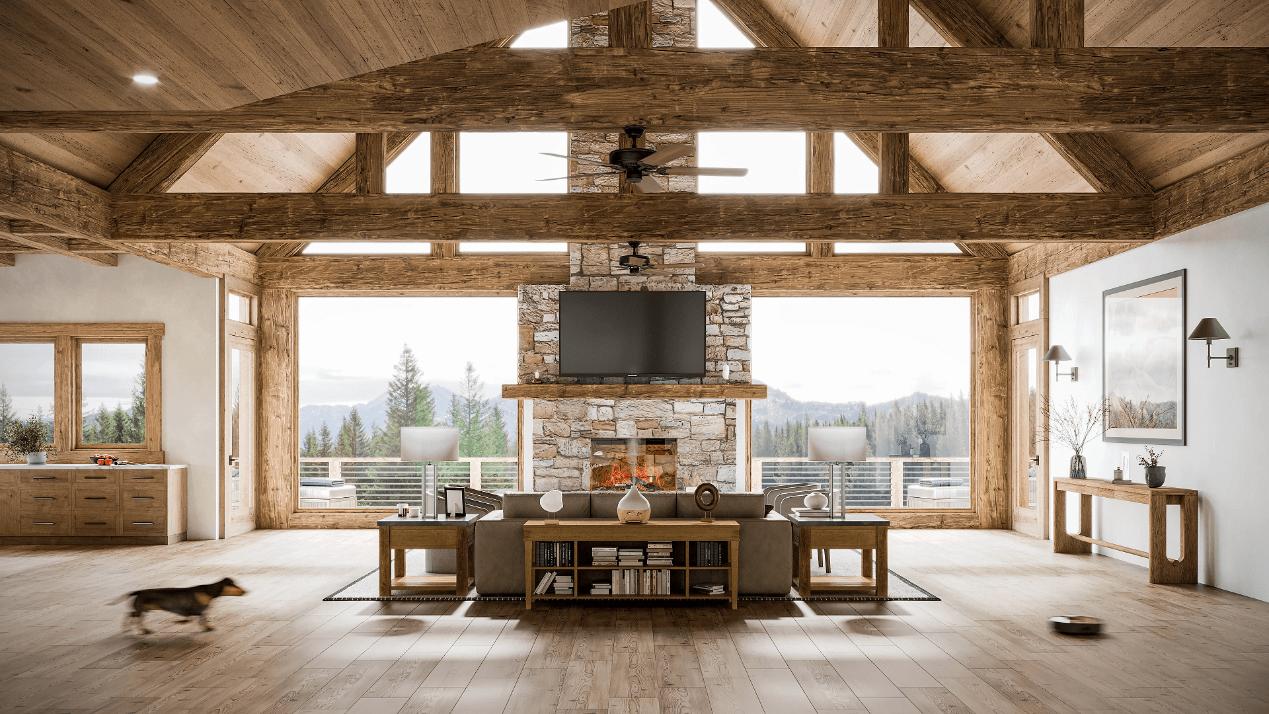
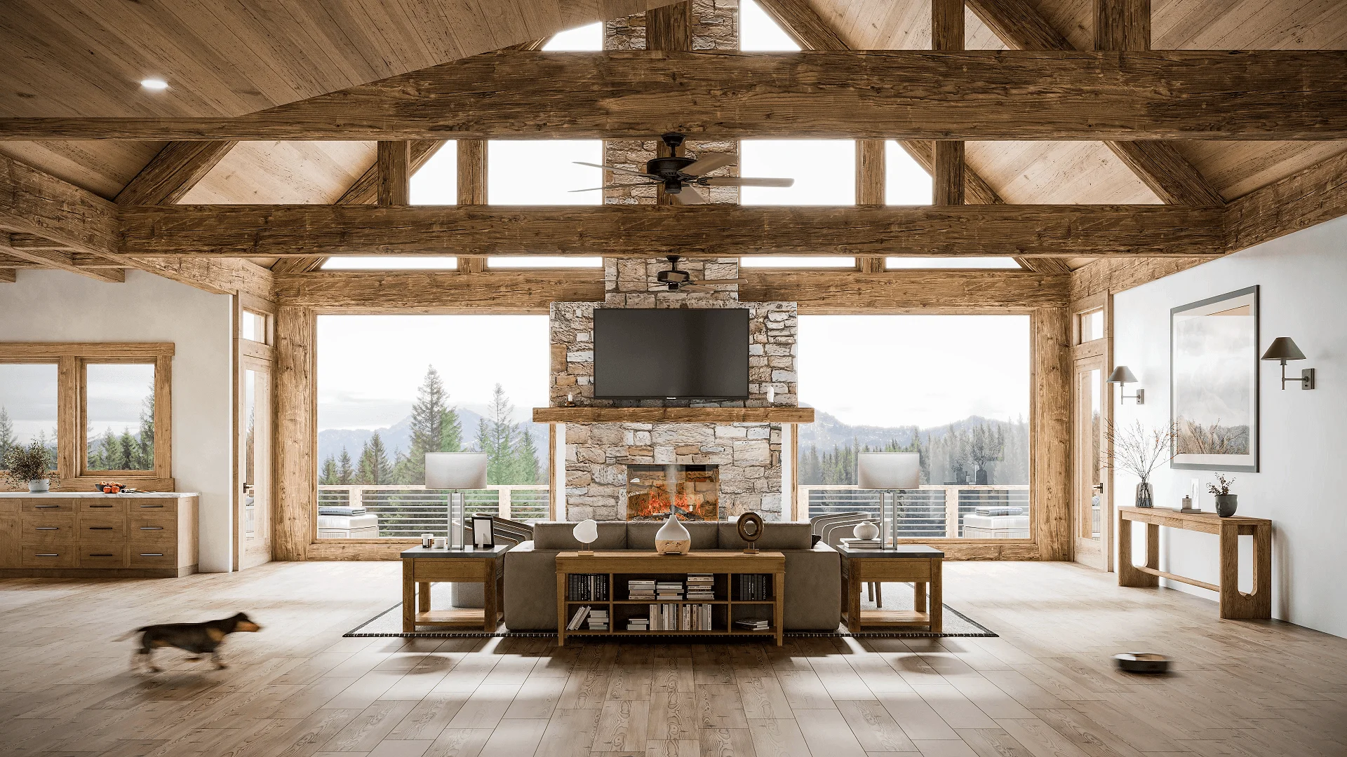
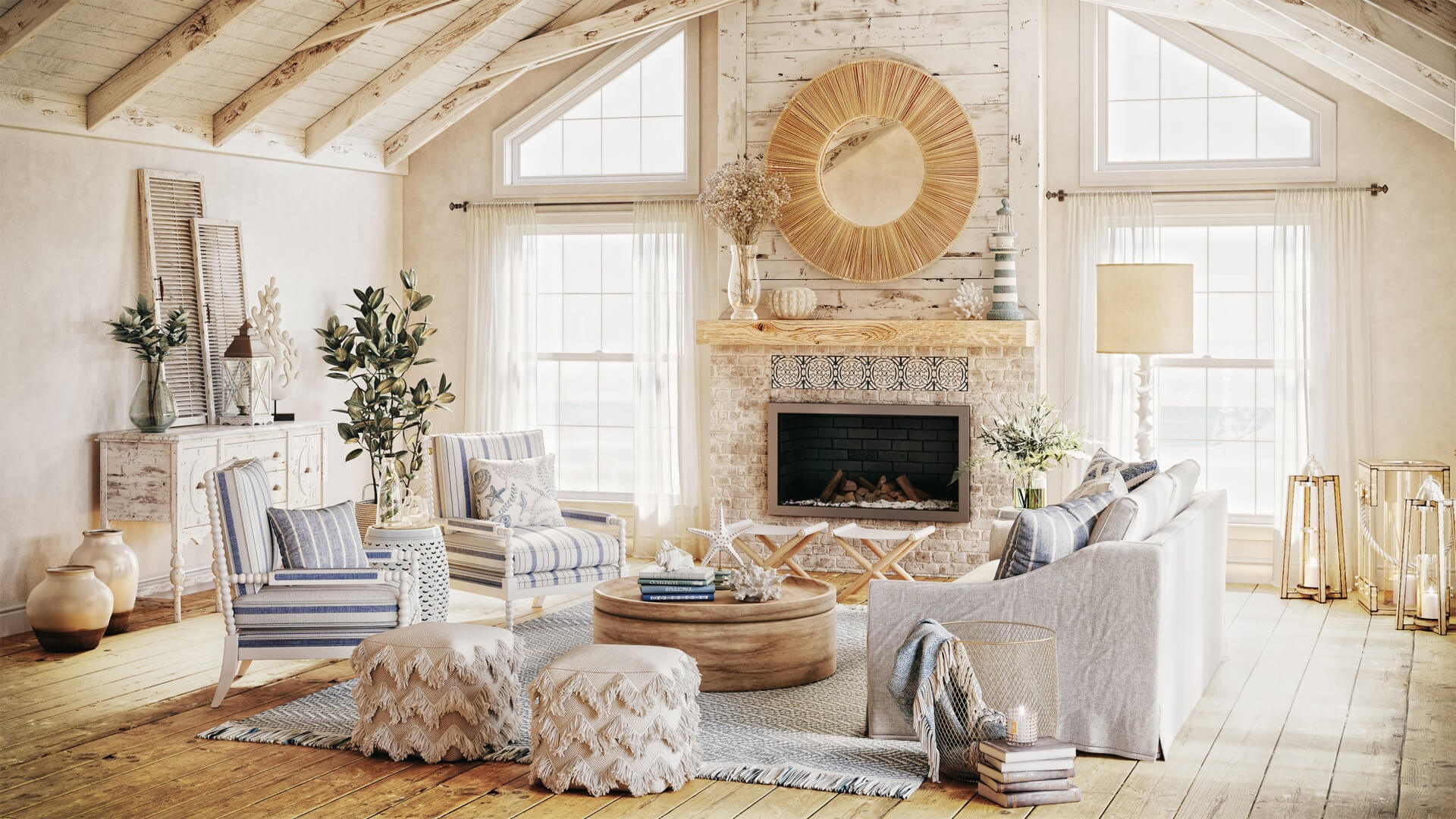
Photorealistic CGI interior — living room showing depth, material interaction, and daylight atmosphere
The shift that many designers are navigating now is a move from collecting references to constructing environments. The tools that enable this are not new, but they have become significantly more accessible, faster, and more integrated into the standard design workflow over the past several years.
Today, many designers use 3D interior visualization to communicate not just furniture placement and finishes, but also scale, lighting, mood, and the overall experience of a room. Instead of showing a client a photograph of somebody else’s interior as a reference point, they show a rendered image of the client’s own future room — with the correct dimensions, the confirmed material selections, the actual window positions, and a simulated version of the light conditions that will define it at different times of day.
The workflow that makes this possible involves digital scene building: modelling the room geometry accurately, applying material textures and reflectance values, setting up artificial and natural light sources, and framing camera viewpoints that correspond to how a person will actually experience the space. The result is not a photograph, but it reads with photographic clarity — and it communicates the design intent in a way that no mood board or elevation drawing can fully replicate.
This is not a replacement for the creative intuition that goes into a mood board. The rendered image is a downstream translation of decisions that begin with exactly that kind of intuitive, atmospheric thinking. What it replaces is the ambiguity between designer intention and client understanding — the gap where misreadings, missed expectations, and late revisions tend to originate.
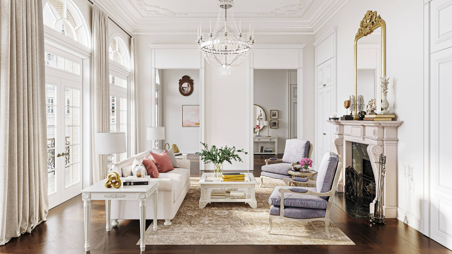
Why Realistic Interior Presentation Improves Client Communication
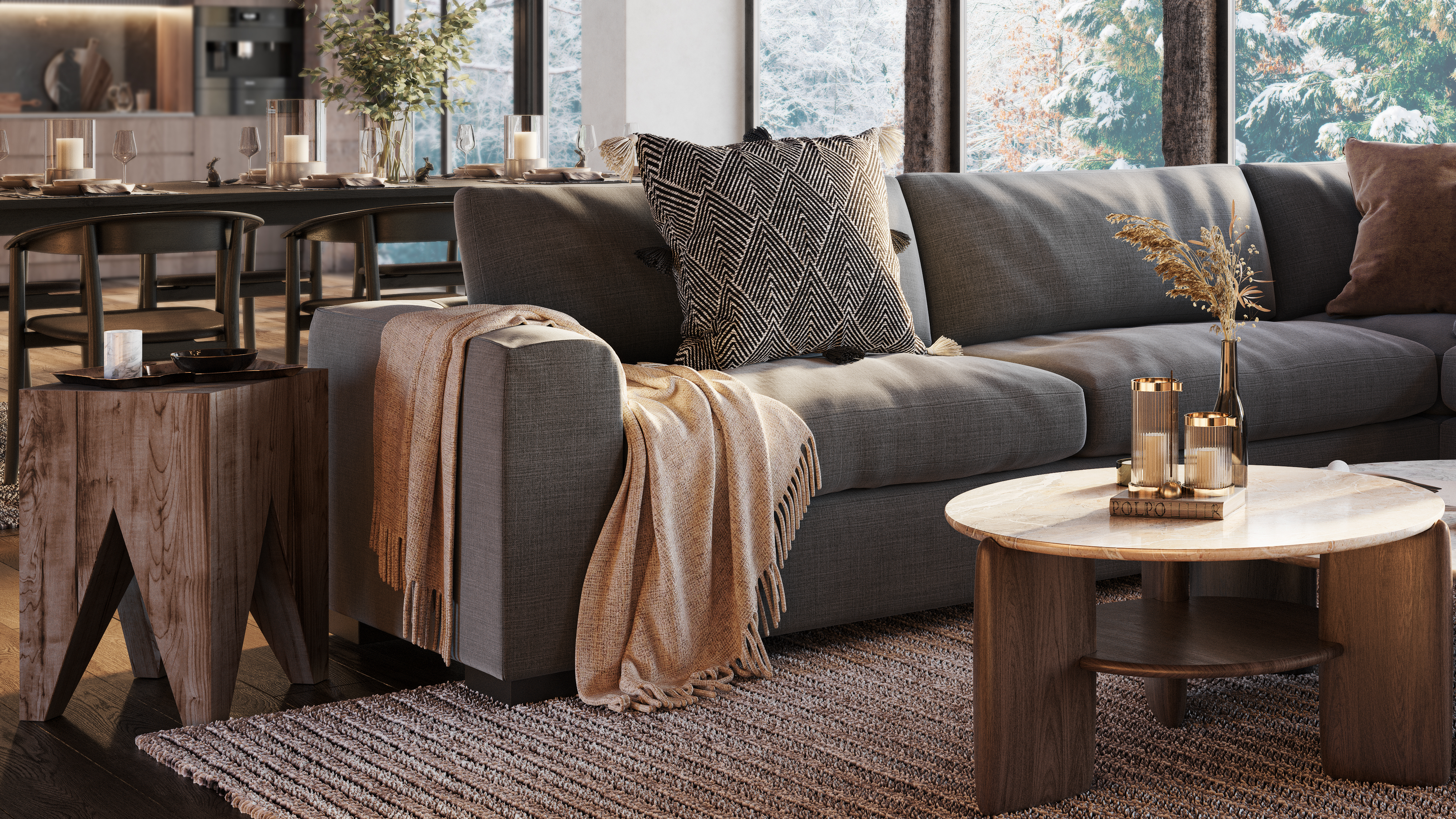
Interior render — lighting, texture, and furniture placement defining spatial atmosphere
The functional benefits of photorealistic interior presentation map quite directly onto the problems that traditional tools create. When a client can see a rendered image of their future room, several things change about the review conversation.
They can evaluate how the space will feel — not just how it looks in isolation but how it reads as an environment. Does it feel as calm as they expected? Is it warmer or cooler in tone than they imagined? Do the proportions feel generous or constrained? These are subjective judgments, but they are judgments that clients are well-equipped to make when given a realistic visual reference — and quite poorly equipped to make from technical drawings or reference collages.
Finishes and material selections become reviewable in context. A client who has been uncertain about a dark-stained timber floor can now see it in the actual room, under the actual light conditions, next to the actual wall colour and furnishings. The uncertainty resolves — one way or another — into a clear preference backed by accurate visual information. The designer gets more useful feedback, and the client makes more confident decisions.
Lighting conditions, in particular, become available for review in a way that no other presentation method allows. Daylight through specific window positions, the spread of table lamps across a seating arrangement, the effect of recessed ceiling lighting on a textured feature wall — all of these can be simulated and presented, giving clients an understanding of their future environment that is grounded in reality rather than imagination.
The practical outcomes of this improved understanding are significant: fewer misunderstandings during build, more precise revision requests, faster approvals, and a stronger sense of confidence and trust between client and designer throughout the project.
Presentation Is No Longer Just About Style
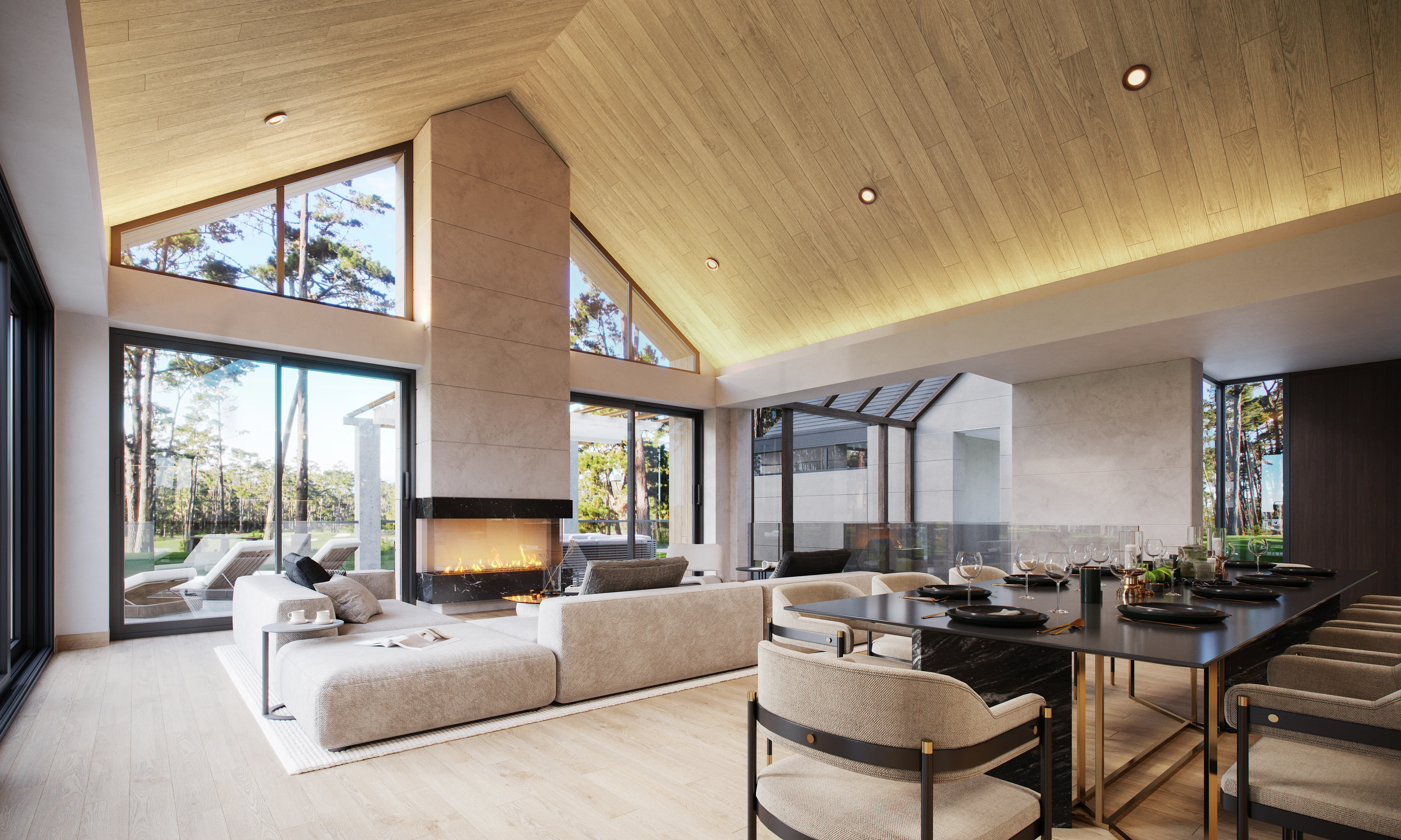
Two design variants rendered for direct comparison — same room, different material directions
There is a temptation to frame visualization primarily as a tool for making design look attractive — the beautiful render in the presentation deck, the image that wins the pitch. That framing is understandable, but it undersells the operational value of clear visual communication in a design project.
When a designer can present two or three spatial options side by side — different material directions, different lighting treatments, different furniture arrangements — all rendered at the same level of realism and in the same room, the comparison becomes genuinely productive. Clients are not choosing between abstract concepts. They are choosing between experienced environments. The conversation shifts from subjective to informed, and the decisions that result from it are more reliable.
Visualization also supports the iterative dimension of the design process. A rendered scene is not a finished image in the way that a photograph is; it is a working model that can be adjusted. Changing a wall colour, substituting a furniture piece, testing a different lighting temperature — these adjustments take time, but they take far less time than discovering the same information after installation. The ambiguity that mood boards leave unresolved — about how choices will cohere, about whether the concept holds up spatially — can be resolved before it becomes consequential.
Good presentation, in this sense, is not primarily about aesthetics. It is about reducing ambiguity to a level where decisions can be made with confidence. That is a different kind of value from a beautiful image, and it is one that benefits everyone involved in a project — designer, client, contractor, and the space itself.
What This Means for Interior Designers Today
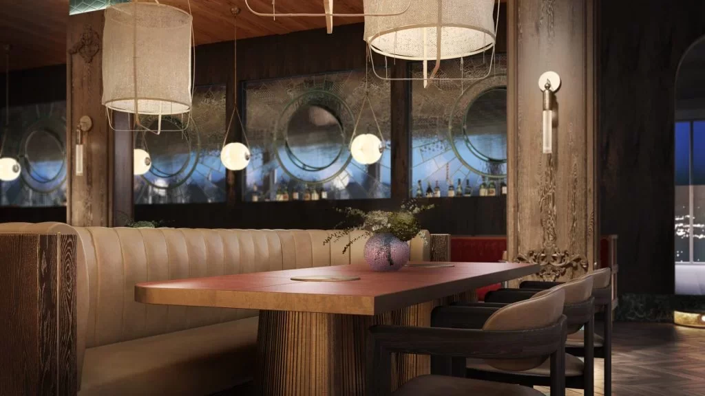
Close-up interior CGI — material quality, texture detail, and lighting at photorealistic resolution
The practical implication of this shift is not that every interior project requires a full suite of photorealistic renders. It is that designers benefit from thinking about presentation as a spectrum — from the open-ended inspiration of a mood board at one end, through progressively more spatially specific tools, to a rendered environment that can be reviewed with precision at the other.
Different projects will require different positions on that spectrum. A small residential renovation with an engaged, visually literate client may require very little beyond well-curated references and a clear finish schedule. A large commercial interior project with multiple stakeholders, brand constraints, and a complex brief will likely benefit significantly from visualized environments — because the cost of misalignment in that context is high, and the range of interpretations that different stakeholders bring to the same set of plans is wide.
What visualization offers the designer, practically, is a stronger ability to communicate with people who are not designers — clients who cannot read elevations intuitively, stakeholders who respond to images rather than specifications, approval committees who need to see before they can commit. This is not a deficit on the client’s part. It is simply how most people relate to spatial information, and a presentation workflow that accounts for it serves everyone better.
It also raises the perceived standard of the design process itself. A designer who can show a client a photorealistic image of their future room — accurately, with the right materials, the right light, the right scale — is demonstrating a level of precision and investment in the outcome that mood boards and reference boards, however beautifully assembled, do not convey in the same way.
Conclusion
Mood boards are not going anywhere — and they should not. The early-stage thinking they enable, the atmospheric direction they set, and the creative conversation they open between designer and client are genuinely valuable, and no downstream tool replaces them at that stage of the process.
But in many interior projects, mood boards are now the beginning of presentation rather than the end of it. The expectations that clients bring to design projects have shifted, and the tools available to designers have made it possible to meet those expectations without sacrificing creative intent.
The evolution from reference boards to realistic spatial visualization is ultimately about one thing: making design intent easier to understand, evaluate, and trust. When a client can see their future room with accuracy and clarity — before a single wall is touched — the entire process becomes more confident, more aligned, and more likely to result in a space that delivers what was imagined at the very beginning.