Keeping up with social media design can be exhausting. Every platform wants a different size, every campaign needs a fresh look, and unless you have a designer on call, it’s easy to feel overwhelmed. I used to spend hours trying to make posts look good, only to end up frustrated and behind schedule.
Then I started leaning on free templates—and honestly, it’s been a game-changer. You don’t have to design everything from scratch. Swap in your text, drop in a photo, tweak a color or two, and suddenly your post looks polished.
Here are a few resources I actually use and recommend:
Table of Contents
Canva
Canva is the obvious choice. Tons of ready-made templates for Instagram, Facebook, TikTok, LinkedIn… you name it. Even the free plan gives you plenty to work with. I like it for quick edits when I don’t have time to fuss over details.
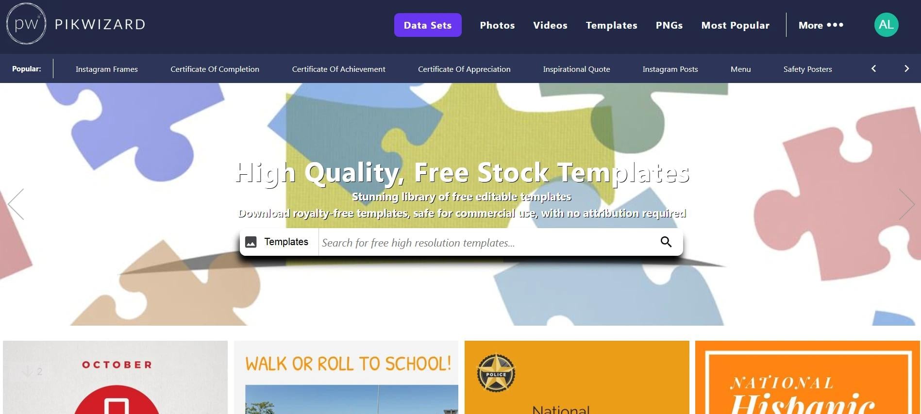
Pikwizard
Most people think of Pikwizard for free stock photos, but it’s also got templates you can use right away. The beauty of Pikwizard is you can pick a great image and turn it into a finished social post in minutes.
There is a large collection of free templates that can be edited by their internal instrument (DesignWizard) and later used in your social media or blogs. I use it when I’m in a rush but still want something that looks professional.
Adobe Express
Adobe Express (formerly Spark) has some surprisingly nice free templates. They feel a little more polished than Canva’s, which is nice if you want your posts to stand out a bit more.
VistaCreate (Crello)
VistaCreate has templates that look modern and trendy. It’s one I turn to when I need Instagram Stories or Pinterest posts that pop.
Quick Tips
- Use your brand colors – Don’t leave everything in the template’s default colors.
- Swap in your fonts – Small tweaks make templates feel unique.
- Use good photos – Free stock images from Pikwizard can take a template from “meh” to “wow.”
- Stick to a style – Changing templates every week makes your feed look messy.
Turn Templates Into a Simple System
Templates save time on a single post. A system saves time every week.
Here’s how I turn a few generic templates into a repeatable workflow:
- Pick 3–5 “evergreen” layouts per platform
- 1 for quotes
- 1 for carousels or tutorials
- 1 for promo / sales
- 1 for testimonials
- 1 for announcements or news
Use these on rotation instead of grabbing something totally new every time.
- Create a mini brand kit inside your tool
Most tools (Canva, Adobe Express, VistaCreate) let you save:- Brand colors
- Primary/secondary fonts
- Logo variations
Set these once so every new template already feels “on-brand” before you touch anything.
- Lock key elements
In Canva and similar tools, you can “lock” certain layers:- Logo placement
- Footer or header bar
- Handle / website URL
That way, when you or someone on your team edits the file, they’re only changing text and imagery—not breaking the layout.
- Name your templates clearly
Instead of “Untitled design (13)”, name them:IG – Quote Template – Brand ALinkedIn – Carousel – Case StudyPinterest – How-To – Long Form
This sounds small, but it makes it much easier to reuse and delegate.
How to Choose the Right Template (So It Doesn’t Look Generic)
A lot of templates look good… until you add your content. Here’s how I quickly evaluate whether a template will actually work in a real feed.
- Check for hierarchy
Ask yourself:- Is there a clear place for the main message (big, bold text)?
- Is there space for a subheadline or supporting line?
- Is the call-to-action obvious?
If everything is the same size and competing for attention, I skip it.
- Look at it on mobile, not just in the editor
Most of your audience is viewing your content on a phone.- Avoid super small body text.
- Avoid cramming too much copy into one frame.
- Make sure key words are readable at a glance.
- Avoid overused “trendy” styles—unless they fit your brand
Not every brand needs:- Neon gradients
- Crazy 3D text
- Overly “Gen Z” aesthetics
Trendy is fine. Off-brand is not. Your templates should mirror your tone: minimal, playful, bold, corporate, etc.
- Check how it works as a series
One nice-looking post isn’t enough.- Can this layout be adapted into multiple posts?
- Does it work for different content types (tips, quotes, stats)?
- Will it still look good next to other posts in your grid?
Make Templates Feel Custom (Without Starting From Scratch)
The goal isn’t to hide the fact you used a template—but you also don’t want your posts to look like everyone else’s.
Here’s how I differentiate mine with very little extra effort:
- Change at least one major design element
For example:- Swap the background shape (circle → rectangle, solid → gradient)
- Adjust alignment (centered → left-aligned text)
- Replace default icons with your own icon set
- Define a “signature” element for your brand
This could be:- A particular corner radius or shape
- A highlight color you always use for keywords
- A specific placement of your logo or username
Repeat this across templates so people start recognizing your content.
- Standardize your image style
Especially if you’re using free stock photos:- Stick to a consistent mood (bright and airy vs dark and moody)
- Use similar cropping (close-up vs wide shots)
- Consider applying the same filter or adjustment for cohesion
Don’t Forget Performance: Design With Results in Mind
Pretty posts are nice. Effective posts are better.
When I’m using templates, I keep a few performance-focused questions in mind:
- Is the main benefit obvious in 2–3 seconds?
Especially for:- Ads
- Promotions
- Webinar / event posts
- Is the CTA crystal clear?
Examples:- “Save this post”
- “Click the link in bio”
- “Comment ‘GUIDE’ and I’ll send you the link”
- Is the design supporting the message—or competing with it?
If the background is more eye-catching than the text, I tone it down:- Reduce opacity
- Simplify shapes
- Use more negative (empty) space
- Am I designing for the format?
- For fast feeds (like TikTok or Reels covers), go bold and minimal.
- For carousels or LinkedIn slides, give more breathing space for text.
Over time, pay attention to which template types actually drive:
- Saves
- Shares
- Clicks
- Replies or DMs
Then lean more heavily into those styles.
Common Mistakes When Using Free Templates
A few things I see all the time (and try to avoid):
- Too many fonts
Stick to:- 1 main heading font
- 1 body font
And maybe 1 accent font if you really need it. More than that starts to look amateur fast.
- Low-contrast text
Light grey text on a pastel background might look cute in the editor—but it’s unreadable on small screens. Aim for strong contrast between text and background. - Tiny logos or no branding at all
You don’t need to slap a huge logo on everything, but:- Add a small logo, handle, or URL on each design
- Keep it consistent in size and placement
- Inconsistent styles across platforms
You can adapt layouts, but your brand should still feel like you everywhere:- Same colors
- Same tone of imagery
- Same voice in copy
- Using “default” placeholder copy
It sounds obvious, but I still see posts go out with “Your catchy headline here” or lorem ipsum. Always triple-check before scheduling.
Accessibility & Trust: The Professional Touch Most People Skip
If you want your brand to feel professional and trustworthy, design isn’t just about aesthetics.
- Add alt text where platforms allow it
Briefly describe what’s in the image and the key text. This helps with:- Accessibility
- Sometimes, discoverability
- Avoid misleading visuals
Don’t use charts, stats, or fake UI mockups that imply results you can’t deliver. Visuals should support honest messaging. - Be consistent with your promises
If your template says “Free guide inside”, make sure the link or carousel actually delivers that value. Design sets expectations; your content needs to back it up.
Putting It All Together
You don’t need to be a designer—or hire one—to show up with polished, consistent social media content.
By:
- Using tools like Canva, Pikwizard, Adobe Express, and VistaCreate
- Creating a small library of reusable, on-brand templates
- Making a few smart tweaks for hierarchy, readability, and performance
- Paying attention to accessibility and honest, clear messaging
…you can dramatically upgrade the look and impact of your social posts without dramatically increasing your workload.