Disclosure Sponsored Links: This post contains a paid-for sponsored link, meaning we have received compensation in exchange for including it. Sponsorship does not influence our content, but we believe in transparency regarding paid placements.
AI logo makers have become a fast and accessible way to create a brand identity. But while they often look perfect on screen, using them in printed materials introduces a new set of challenges. Digital and print environments require different formats, resolutions, and color models. Without proper adaptation, even a high-quality logo can look inconsistent or unprofessional. This article explains the key differences between digital and print use and how to prepare your AI logo for both.
Table of Contents
The key differences between logos for print and screen
Digital platforms operate in RGB color mode, with flexibility for effects like gradients, shadows, or transparency. Print, by contrast, uses CMYK — a subtractive color model where many vibrant digital tones don’t translate accurately. On screen, logos are backlit and dynamic; in print, they must rely on precise contrast, clean outlines, and balanced composition.
Thin lines, subtle shadows, or pastel colors that work in digital ads may lose clarity when printed. Logos designed for screen use may also suffer from scaling issues when enlarged for packaging or signage. That’s why format, resolution, and layout must be optimized separately for each use case.
What file formats to use for print and digital
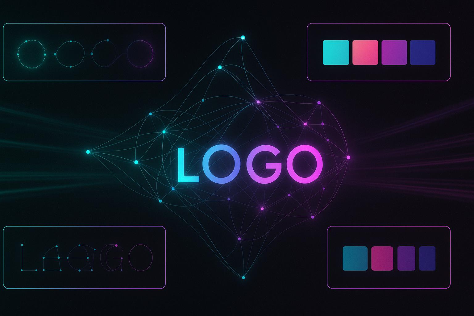
In digital contexts, the most common formats are PNG for transparency and SVG for responsive, resolution-independent graphics. These are ideal for websites, apps, and emails. For print, you need vector formats like PDF, AI, or EPS, which preserve curves, lines, and proportions no matter the output size.
JPEGs are not recommended for either use case when quality matters. They compress detail, lack transparency, and are difficult to scale. Always ensure that your AI-generated logo is exported in multiple formats to meet both digital and print needs from the start.
How to adapt an AI logo for print materials
Technical and visual adjustments to make:
- Convert color mode from RGB to CMYK
- Increase stroke weight to improve visibility
- Avoid complex gradients and soft shadows
- Use vector formats for accurate scaling
- Test contrast and layout on physical proofs
Before finalizing for print, run a test print or preview the file in CMYK mode to ensure clarity. Logos with neon, pastel, or very dark tones may appear dull or washed out. Adjustments made during this step can prevent costly production errors and preserve your brand integrity in physical formats.
How to adapt an AI logo for digital platforms
Digital use demands versatility. You should create multiple versions of your logo — including horizontal, vertical, light, dark, and transparent background formats. Make sure the logo is legible on mobile screens, in browser headers, and across different social platforms.
Digital logos can incorporate interactive or animated elements, especially in web design or video intros. These versions must be saved in modern formats like Lottie (for animation) or optimized SVGs. Keeping file size low without losing resolution is essential for page speed and UX.
Common mistakes when using the same logo across all platforms
One of the most frequent mistakes is using a single logo file everywhere — print, web, packaging, ads. This can lead to pixelation, incorrect colors, or technical rejection by printers. AI-generated logos are only effective when exported and prepared with use case in mind. Many AI logo makers now allow you to export logos in both print-ready and digital formats, but it’s still essential to check color modes, resolution, and scaling before final use.
Create a brand asset set with designated files for each purpose: print-ready vectors, responsive digital formats, and compressed versions for email or app use. This ensures visual consistency and technical compatibility without sacrificing design integrity.
Questions and answers
Can I use a PNG logo for print?
No. PNG is suitable for screens only. For print, use vector formats like PDF, EPS, or AI to ensure quality and scalability.
Do I need to convert an RGB logo for printing?
Yes. RGB colors often do not print accurately. Convert the file to CMYK to see how it will appear in real-world print output.
Can a logo be universal for all platforms?
Only if it is properly prepared in multiple formats and color models. One-size-fits-all doesn’t work for professional branding.
How do I check if my logo is print-ready?
Export it to CMYK, print a proof, and check for clarity, contrast, and any visual distortion at different sizes.
Should I edit an AI-generated logo for print use?
Yes. Even if the logo looks fine digitally, line weight, color accuracy, and scaling should be reviewed before sending to production.

