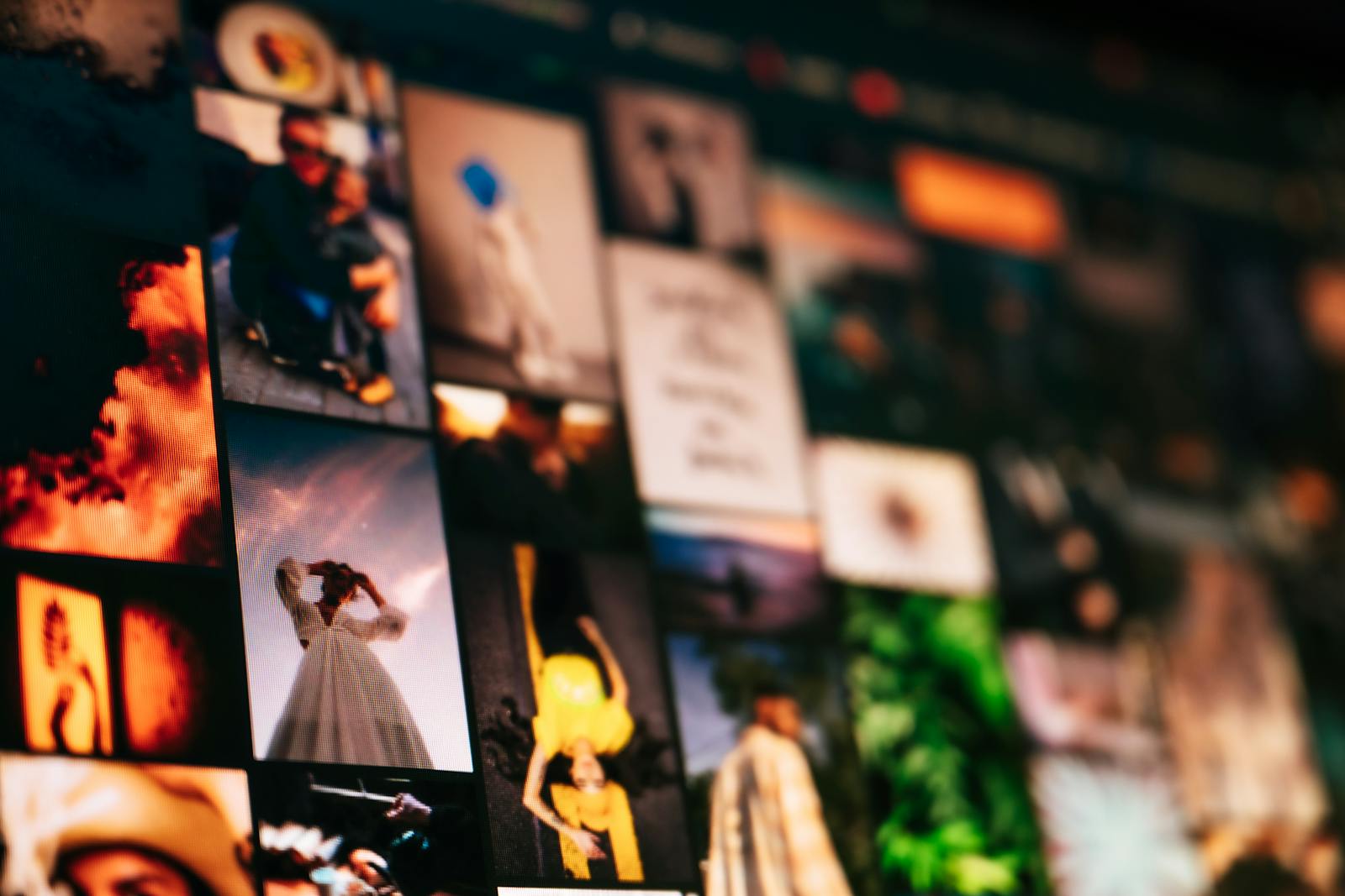
Have you ever noticed that the thumbnails on Instagram Reels, TikTok, and YouTube all appear to be the same? The same frightened faces, noticeable type overlays, and eye-catching color schemes are frequently seen in YouTube, TikTok, and Instagram Reels thumbnails, all of which manage to blend in with the background noise.
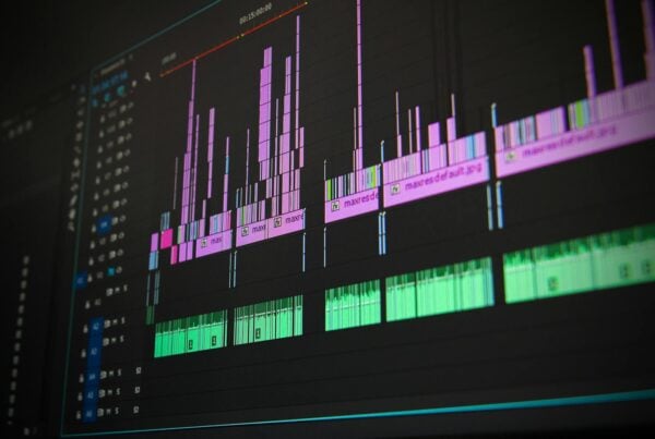
You don’t need a design degree or hours of practice with specialized software to make thumbnails that stand out. You can make eye-catching images that show off your unique style and stop people mid-scroll if you use the correct tactics and tools, including AI thumbnail generators. Let’s look at ten quick strategies to move away from the usual thumbnail design and make pictures that really show off your business.
The thumbnail is like a retail window for those who make content. The thumbnail should clearly show how valuable your material is, fit with your brand’s personality, and grab people’s attention so they click right away.
Table of Contents
1. Stop Making Faces That are Too Dramatic
You know the ones: big eyes, fake astonishment, or really strong pointing. These got popular for a while, but now they’re just visual noise.
Instead, try to show real feelings that match the tone of your text. For tutorials, indicate that you are focused or satisfied. Show genuine joy or awe in your trip vlog.
You may try out different moods using an AI thumbnail generator without having to set up complicated photo shoots. Simply tell the tool what kind of feeling you want, and it will give you options that feel real.
2. Try Out Color Combinations That You Wouldn’t Anticipate
Most thumbnails use high-contrast colors, such as red and yellow or blue and orange. These work, but they also make your material less noticeable.
Try using less typical color schemes, including jewel tones, pastels with dark accents, or monochrome designs with a splash of color. Pick colors that fit your brand but are different from what your competitors use.
When you use AI tools, tell them to show you how other color combinations look before you decide on one.
Pro Tip: Look at the most popular producers in your field to determine which colors are most popular. Then choose an alternative color scheme that still works well together.
3. Don’t Only Use Text to Give Information; Use It as a Design Element.
Many authors incorporate text into thumbnails at the last moment, selecting bold, blocky characters to effectively communicate their message.
Instead, consider text to be a part of your design as a whole. Use different types of text, mix words into the layout, or use very little text that makes people curious instead of explaining everything.
Use one or two strong words instead of whole phrases. “EXPOSED” has more impact than “I’m Going to Expose This Secret.” Your title gives the details, yet the mystery draws them in.
4. Use Negative Space in a Smart Way
There are many cluttered thumbnails out there, with pictures, text, arrows, and graphics on every inch. This makes it tougher to read thumbnails, especially on mobile.
Be open to space. Make room for your main topic. When it’s small, a clear, uncomplicated thumbnail with lots of space can be very striking and easier to read.
To avoid overcrowding, ask for “clean composition with negative space” or “minimalist design with breathing room” when making AI questions.
5. Make a Consistent Visual Signature
Having a constant visual aspect across all of your material helps people remember your brand, even though each thumbnail should be different.
This could be a certain design feature, a color accent, the location of a logo, or a certain way of putting things together.
To make your brand stand out from the rest, you need to find a balance between consistency and variation.
6. Use Asymmetrical Layouts To Break the Grid
Thumbnails usually have a simple layout: the subject is on one side, and the text is on the other, or everything is centered.
Use asymmetrical compositions to deviate from the norm. Put your subject off-center, employ diagonal lines, or make focus points that aren’t expected.
Asymmetry naturally draws the eye and makes things feel tense, which keeps viewers’ attention longer. This method works exceptionally when you’re up against rows of thumbnails that are all the same size.
7. Depth and Dimension of the Layer
It’s common to see flat thumbnails. Adding layers, shadows, and little 3D effects will give yours more dimension and make it look more sophisticated.
Use things in the foreground to frame your topic or add depth using shadows and color gradients.
You can use AI tools to try out different things. For example, you could use “cinematic depth of field” or “layered composition with foreground and background.”
8. Write a Short Story
Instead of a still picture, provide a tiny story in your thumbnail, a before-and-after, a progression, or a hint at a change.
Micro-storytelling makes people want to know more. Viewers want to know what happens next in the story.
This style is ideal for tutorials, makeovers, or any other content that has to do with a journey or a transition.
9. Use Visual Metaphors That are Surprising
Instead of real pictures, use analogies that are interesting. In productivity videos, don’t show a person at a desk. Instead, show a rocket launch or gears turning smoothly.
People click more when they stop and think about metaphors.
Use phrases like “productivity as a well-oiled machine” or “creative breakthrough as a light bulb moment” to get AI to make new pictures.
10. Try Out and Change Different Styles
You won’t find the right style for your thumbnail right away.
Make a lot of different variations and see which one works best. Look at your analytics to evaluate what performs best in terms of click-through rates.
AI thumbnail generators make your job easier by letting you quickly build dozens of different versions and try out different styles, colors, and layouts.
How to Make Your Thumbnail Workflow Work
To begin, please ensure you clearly understand the main point of your article. Pick one of these ten tactics that best gets your point across while still standing out.
Create prototypes of ideas using an AI generator. Discuss your mood, colors, vision, and composition, and then make some decisions. Choose the one that appeals to you the most.
Refine by changing prompts and trying out alternative versions.
Lastly, monitor the effectiveness of your efforts and the opinions of your audience. It’s acceptable if what you believe looks good but doesn’t resonate with your audience. Make things better with the data.
Are You Ready to Stand Out?
There is no need to use a template to create unique thumbnails. You only need to understand the fundamentals of design, know your brand, and be willing to try new things.
You don’t need to be a designer or have a lot of time to use AI thumbnail generators and other tools to bring these ideas to life.
Even though there is a lot of content, your thumbnails don’t have to look busy. Please put these tips into action right away so you can see how they improve the uniqueness of your writing.
Frequently Asked Questions
1. How long does it take for AI to make a unique thumbnail?
You can make a thumbnail in seconds with AI technologies like QuillBot. Simply type in a descriptive prompt, choose your style, and the AI will give you options right away. You can change it and make it again until it is perfect. It only takes a few minutes, rather than hours with regular design software.
2. Do I need to know how to design to make thumbnails that stand out?
No. These tactics rely more on concepts than on technical know-how. AI tools handle the design element; your role is to provide them with creative guidance. If you give the AI precise instructions, it will create a polished thumbnail for you. Knowing what you want to say and being open to trying new things are the most crucial things.
3. Can I use AI-generated thumbnails on YouTube, TikTok, and Instagram without them looking too much like other thumbnails?
Of course. Using creative prompts and unusual methods, such as unexpected colors, asymmetry, analogies, and negative space, is the key. AI makes your idea come to life, but your ideas give the thumbnails their style. You can also make a lot of different versions and pick the one that works best for you.
Author Bio
Nimisha Sureka is a SaaS (Software as a Service) content writer at Anchorial, a link-building agency. With extensive experience writing for SaaS brands from early-stage startups to established platforms, she specializes in turning complex products into clear, compelling narratives that rank, resonate, and convert.