Minimalism as a concept in art and design emphasises the importance of reducing elements to the essentials, creating a serene and uncluttered environment. This minimalism philosophy has profoundly influenced various fields, including web design. In this blog post, we’ll explore the principles of minimalist art, how they translate into minimalist web design, and the benefits of adopting such an approach for creating clean, focused, and user-friendly websites.
Table of Contents
Understanding Minimalist Art: Foundations and Principles
What is Minimalist Art?
Minimalist art emerged in the mid-20th century as a reaction against the expressive art movements such as Abstract Expressionism. It focuses on simplicity, using monochromatic colour palettes, geometric shapes, and minimal subject matter. The goal is to strip everything down to its essential quality and achieve simplicity.
Key Principles of Minimalist Art
- Simplicity: Everything superfluous is removed to focus on the essential parts of the artwork.
- Geometry: Use of simple, geometric forms and clean lines.
- Harmony: Despite the simplicity, there is a strong sense of balance and cohesion.
- Functionality: Each element is necessary and functional.
These principles are not only foundational in creating visual art but also apply to other design forms, including web design.
Translating Minimalist Art Principles into Web Design
How the Principles of Minimalist Art Apply to Web Design
The principles of minimalist art provide a strong foundation for minimalist web design. By focusing on essentials, emphasising structure, achieving balance, and enhancing functionality, these principles can transform a website into an effective, user-friendly platform. Let’s explore how each principle of minimalist art translates into practical web design strategies, particularly for those interested in website design Toronto.
Simplicity in Web Design
Simplicity in web design transcends the idea of minimal graphic elements; it encapsulates the entire user experience. Simplifying a website involves:
- Clear, Concise Content: Distilling text and visuals to communicate the message effectively without overwhelming the user. This might mean shorter paragraphs, simpler sentence structures, and the use of bullet points to break down complex information.
- Minimalist Aesthetics: Choosing a simple color scheme and a clean, uncluttered layout. This doesn’t just enhance visual appeal but also improves readability and focus.
- Streamlined Navigation: Reducing the number of menu items and avoiding deep navigation hierarchies to facilitate quick and easy access to information.
These aspects of simplicity help focus a user’s attention on what is most important, enhancing the effectiveness of the website.
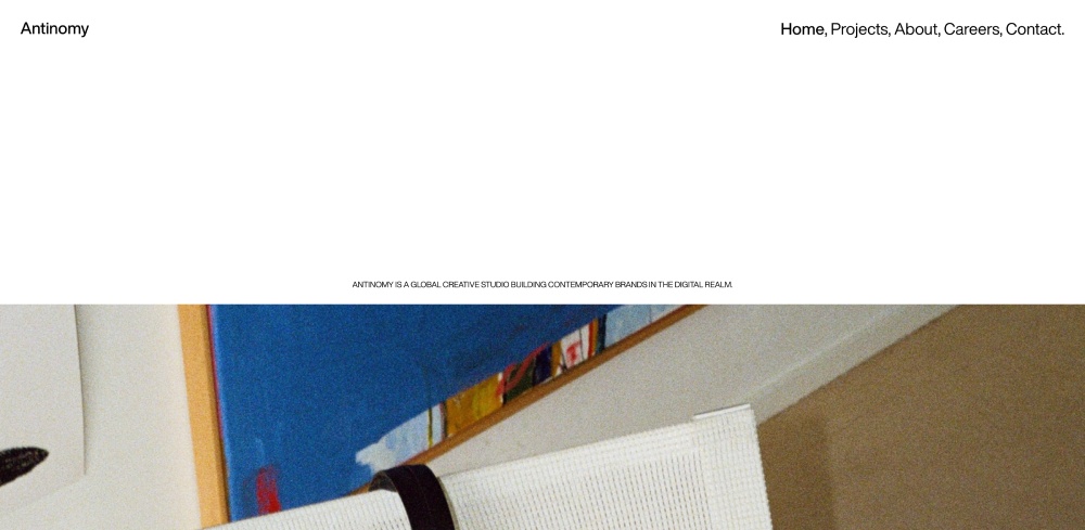
Example of simplicity in web design – antinomy.studio
Geometry in Web Design
Geometry plays a critical role in structuring and organising content on a website. In minimalist web design, geometric principles can be applied through:
- Grid-Based Layouts: Using grids to create a solid structural layout that aligns elements neatly and logically. This helps in building a visually balanced site that is easier to navigate.
- Clean Lines and Shapes: Employing clean, sharp lines and geometric shapes to define spaces and direct the viewer’s eye across the page. This can help highlight key sections like call-to-action buttons or important content.
- Consistency: Regularity and symmetry in the design elements, such as consistent font sizes, image styles, and button shapes, which create a rhythm and make the website easier to interact with.
These geometric considerations help in crafting a website that is not only aesthetically pleasing but also functionally organised.
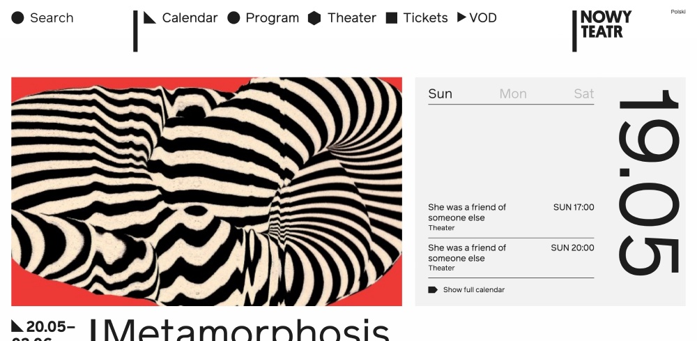
Example of geometry in web design – nowyteatr.org
Harmony in Web Design
Harmony in web design refers to the aesthetic balance and cohesion between different elements of the website. Achieving this involves:
- Balanced Layouts: Ensuring that the visual weight of elements is evenly distributed across the page. This can involve adjusting the layout so that images, text, and white space are balanced, providing a pleasing aesthetic that doesn’t feel cluttered or skewed.
- Consistent Theme and Style: Keeping a consistent theme and style across all pages enhances the cohesive feel of the website. This includes using a consistent color palette, typography, and graphic style that align with the brand’s identity. You can check this site https://www.uspatriotsteel.com/south-dakota-metal-buildings/.
- Visual and Content Alignment: Aligning the content with the visual elements to ensure that each complements the other, reinforcing the website’s message and improving the overall user experience.
Through these strategies, a minimalist website can achieve a sense of harmony that makes the experience not only coherent but also engaging for the user.

Example of harmony in web design – panache.fr
Functionality in Web Design
Functionality is a cornerstone of minimalist web design, focusing on usability and the purpose of each element. This includes:
- Purpose-Driven Design: Every element on the website should serve a clear purpose. This means eliminating purely decorative features that do not enhance user understanding or interaction.
- User-Centric Layouts: Designing layouts that cater to the needs of the user, such as easy-to-read fonts, intuitive navigation, and accessibility features like keyboard navigability and screen reader compatibility.
- Responsive Design: Ensuring the website functions seamlessly across all devices and platforms, adapting layout and content to fit different screen sizes without losing functionality.
Implementing functionality in minimalist web design not only streamlines the experience but also ensures that the website is practical, accessible, and meets the needs of all users.
By applying these principles of minimalist art to web design, designers can create websites that are not only visually striking but also highly functional and user-friendly.

Example of functional in web design – gav.space
Implementing Minimalist Web Design: Techniques and Considerations
The Role of Whitespace
Whitespace, or negative space, is a crucial element in minimalist web design. It refers to the unmarked areas of a page, including the spaces between graphics, margins, gutters between blocks of text, and even the spacing around buttons. Far from being merely ’empty’ space, whitespace is an essential design element that helps to define the architecture of a page. It enhances readability and directs focus by creating a visual breathing room for the eye. Effective use of whitespace can lead to a more harmoniously balanced website which invites users to engage with content without feeling overwhelmed.
Simplification of Elements
In minimalist web design, simplification means reducing the elements only to those that serve a clear purpose. This involves more than stripping away embellishments—it means designing each element to ensure it serves a functional or informative purpose. This might involve:
- Reducing the number of menu options to improve navigability and focus on essential user journeys.
- Streamlining content to avoid overwhelming users with text-heavy pages that dilute the main messages.
- Optimising graphics and multimedia so that they support the content without dominating it.
- Employing a consistent and limited color palette to maintain a coherent feel across the website.
Simplifying a website’s design and content structure can dramatically improve the user interface and user experience by minimizing distractions and focusing the visitor’s attention on what is most important.
Focus on Essential Elements
Identifying essential elements is fundamental in minimalist web design. These elements should enhance user interaction or directly contribute to functionality. Key considerations include:
- Intuitive navigation that anticipates the user’s needs and facilitates easy access to information.
- Readable fonts that improve legibility and accessibility.
- Relevant imagery that conveys crucial information or evokes a necessary emotion or response.
- Call-to-action buttons that are prominently placed without being intrusive.
The emphasis on essential elements ensures that each component has a purpose and supports the overall objective of the website, enhancing both the aesthetic and the functionality.
Benefits of Minimalist Web Design
Enhanced User Experience
By eliminating potential distractions, minimalist design simplifies the user’s decision-making process, making the path from entry to conversion clearer and easier. This often results in a smoother, more efficient user journey, where users feel more confident and less frustrated, leading to higher satisfaction and increased conversions.
Faster Page Load Times
Minimalist websites typically have faster page load times because they contain fewer elements and reduced file sizes from images and multimedia. Faster loading times enhance user satisfaction, contribute positively to Google rankings, and can reduce bounce rates, as users are less likely to leave a site out of impatience.
Easier Maintenance
With simpler design structures and fewer elements, minimalist websites are easier to maintain and update. This simplicity allows for quick adaptations to content or design with minimal risk of breaking site functionality or layout, which is particularly beneficial in maintaining long-term website health and responsiveness.
Better Compatibility Across Devices
The straightforward and scaled-back nature of minimalist design translates effectively across different devices and screen sizes. Simplistic layouts inherently adapt more fluidly to the constraints of mobile devices, ensuring a consistent and user-friendly experience whether viewed on a desktop, tablet, or smartphone.
Overall, the minimalist approach in web design not only reflects sophistication and modernity but also aligns with the functional needs and behavioral patterns of today’s users, ensuring a timeless and effective design solution.
Is Minimalism Right for Every Website?
Minimalism in web design offers numerous benefits, but it’s not a one-size-fits-all solution. The approach is well-suited for websites that aim to deliver a clear, focused message without unnecessary complexity. It works best when the content itself can stand out with minimal embellishment.
Questions to Consider Before Choosing Minimalism:
- What is the primary goal of the website?
- Who is the target audience?
- What kind of user experience do you want to provide?
By answering these questions, you can determine whether a minimalist design is appropriate for your website. In the end, minimalist web design, much like minimalist art, is not just about what is removed but what is left behind: clarity, effectiveness, and beauty.
For those looking for a reliable partner to implement minimalist design principles effectively, Convergine.com offers expertise in crafting clear and functional websites that resonate with audiences and adhere to minimalist aesthetics. Based in Toronto, convergine.com can help distill your site’s content and design to its essence, ensuring an optimal balance of aesthetics and functionality.