User experience design may appear rooted in software and product teams, yet its principles echo throughout visual art. Both disciplines consider how people move, look, feel, and respond. A canvas, a printed edition, or a digital composition all ask the same question. How will this be encountered.
Table of Contents
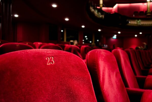
Flow Shapes Attention From Start to Finish
In user experience design, flow refers to how a person moves from one stage to another. Designers test and refine journeys carefully, studying examples and processes that are detailed enough to warrant dedicated resources, even down to reviewing PageFlows pricing to understand how curated user flows are organised and studied. That level of scrutiny shows that movement through an experience is never accidental. Artists can recognise a similar responsibility in their own practice.
In painting, flow is guided by composition. The direction of brushwork, the placement of light, and the balance of forms influence how the eye travels across the surface. A strong diagonal can pull attention rapidly across a canvas. A cluster of contrasting colours can hold it in place. These decisions affect duration and engagement.
Printmaking often builds flow through repetition and rhythm. Lines carved into a plate create movement that feels almost tactile. In a series of prints, variation between editions can guide the viewer through subtle shifts in tone and texture. The journey extends beyond a single frame.
Digital art adds another dimension. Scrolling, animation, and interaction create literal movement. The viewer does not simply look. They navigate. Flow becomes physical as well as visual, yet the principle remains consistent across mediums.
Hierarchy Organises Meaning
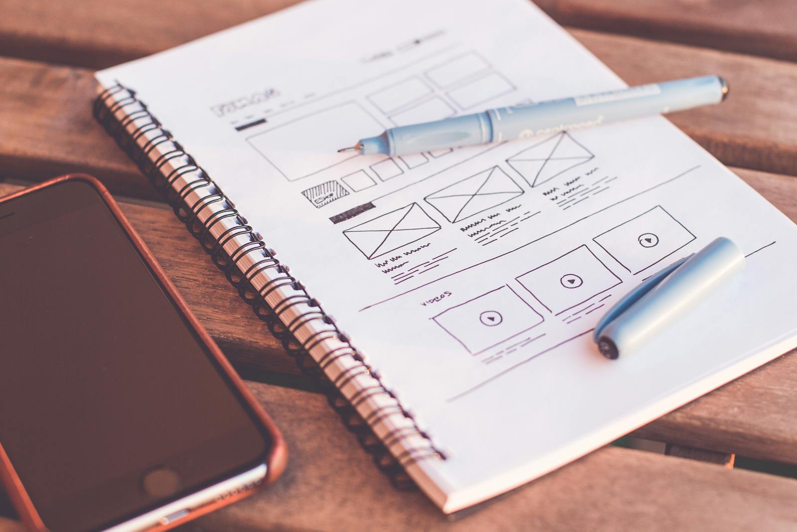
Hierarchy is crucial to UX design because it determines the perceived importance of each element. Through scale, contrast, and placement, designers create structure for users to navigate through and understand the information being presented.
We can also see how hierarchy plays out in paintings. A strong element or bright color indicates that it is the most important part of the composition. Other elements are used to support that primary focus. If there is no defined hierarchy, the painting will seem unbalanced.
In printmaking, tonal contrast is used against the main element to establish hierarchy. Dark shapes in the foreground create a stable foundation for the overall image. Delicate line work recedes into the texture of the background. By understanding these relationships with one another, the viewer can easily read the images presented in the print making process.
Hierarchy within digital art is established through layers and movement. Elements can appear in a sequential order to show hierarchy, or they can respond when a user interacts with them. Elements can also give away hierarchy based off of perceived weight or the amount of time spent on an element. Hierarchy is essential to any work, whether it be print or digital, because it offers a visual framework for the user to use to prevent them from being visually overwhelmed.
Clarity Makes Work Legible Without Simplifying It
User experience design values clarity because confusion disrupts engagement. Clear pathways, readable text, and coherent structure help users understand what to do next. This clarity does not erase complexity. It frames it.
Painting benefits from similar discipline. Even abstract works require internal logic. Colour relationships, spatial balance, and compositional coherence allow viewers to enter the work rather than feel pushed away. Clarity in this sense supports exploration.
Printmaking demands particular attention to clarity because of technical constraints. Limited colour palettes and defined line work require thoughtful organisation. A strong print reads from a distance and rewards closer inspection. That dual readability parallels well designed interfaces.
Digital art faces constant competition for attention. Clarity becomes essential when viewers can close a window instantly. Strong structure, legible typography, and purposeful sequencing help sustain focus. Across mediums, clarity strengthens communication without narrowing interpretation.
Emotional Response Is Designed, Not Accidental
UX designers study emotional response carefully. Colour schemes, micro interactions, and pacing influence how users feel. Frustration or delight can determine whether someone continues or leaves.
Emotional design concepts have been long understood within the art of Painting. Atmosphere may be created by various design elements such as scale, texture, and colour temperature. A detailed piece of art will generally elicit a sense of intimacy; while a large canvas often commands a physical response. These responses come as the result of intentional design choices made by the artist.
Emotional Language exists in Print-Making as well. The weight of ink, the pressure of etched lines, and the texture of woodcut surfaces contribute to tonal response. The nature of such materials will elicit an emotional response and are experienced immediately and physically.
In Digital Art, the emotional response is described by Time-Based Media. The transitions between frames, the sounds created as a result of interaction with the images, and the interactive nature of Digital Art influence rhythm. A slow fade from one image to another creates anticipation, while a abrupt change in visual or auditory will create surprise. No matter if an artist creates using Traditional or Digital Arts, emotional response is always central to the experience.
Iteration Strengthens Artistic Practice
Iteration is standard in UX. Designers prototype, test, and refine repeatedly. The process encourages improvement and reveals blind spots.
Painters often work through studies and revisions. Layers are added and removed. Compositions are adjusted after stepping back. This rhythm mirrors UX testing more closely than it may first appear.
Printmakers rely on proofs to evaluate balance and contrast before finalising an edition. Digital artists test functionality and responsiveness before release. Across all mediums, iteration supports stronger outcomes and more confident decisions.
A Practical Framework for Applying UX Principles in Art
Artists who work in painting, print, or digital art can use the following list to help them create their work:
- Determine the main Centre of interest before detailing it further .
- Be careful about the manner in which the viewer travels around the piece.
- Use things like contrast, size, or movement to create hierarchy .
- Eliminate any of the unwanted things which may interfere with achieving their goal
- Conduct tests using the early drafts and obtain thoughtful feedback
- Consider how the colour and shape create an Emotional impact
- Look at the way the piece appears from both near and far away to determine clarity of view.
- Think about where they will be displayed i.e. wall, page or computer.
- Change the order and timing of the pieces in a series to develop a clearer narrative.
- Keep track of how people have reacted to the work for future projects .
- Go back to an earlier piece and see what structural themes recur throughout the different pieces.
- Think of composition as continuing to evolve rather than being a static/immediate result of their efforts.
These steps offer guidance without dictating style. They provide structure while leaving space for individual voice.
Conclusion
Flow, hierarchy, clarity, and emotional response operate across painting, printmaking, and digital art. The materials differ, yet the viewer’s experience remains central. User experience design articulates these principles clearly and applies them systematically. Artists can draw from that clarity to refine how their work is encountered.
The result is not a shift towards corporate thinking. It is a move towards deliberate craftsmanship. When structure supports expression, the work often communicates with greater confidence. The shared ground between UX and art reveals that thoughtful design principles belong wherever visual experience is shaped.