Disclosure Sponsored Links: This post contains a paid-for sponsored link, meaning we have received compensation in exchange for including it. Sponsorship does not influence our content, but we believe in transparency regarding paid placements.
Converting PSD designs into responsive HTML emails requires a structured approach to ensure compatibility across devices and email clients. A well-coded email should look just as good in Gmail as it does in Outlook while maintaining responsiveness on mobile screens. Since email clients have unique rendering rules, developers need to follow best practices to avoid broken layouts and ensure a smooth user experience.
This article will break down key techniques for converting PSD designs into functional, responsive, and visually appealing HTML emails.
Table of Contents
1. Start with a mobile-first mindset
When converting a PSD design to HTML, it’s essential to think about mobile users first, as most people check emails on their phones. According to a Mailjet survey, 71.5% of consumers mostly use mobile devices to check emails.
For example, instead of a multi-column layout that might get squished on small screens, choose a simple single-column design when you get HTML email from PSD. Like the image below:
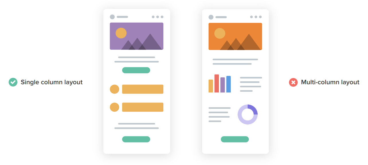
Image Source: Litmus
Use images that automatically adjust in size depending on the screen, so they don’t get too big or small. Buttons should be large and easy to tap on touchscreens. Tap targets of at least 44px x 44px is advisable considering the average adult’s finger pad size of 10 mm.
This approach ensures your email looks great and is user-friendly across all devices.
When coding, you can use fluid grids and media queries to ensure that the design looks great whether it’s viewed on a phone, tablet, or desktop.
With the help of fluid grids you ensure that your email layout scales proportionally to the screen size. Meaning, rather than fixed widths (like 200 pixels), you use percentages to define how wide each column should be. So that even if the screen size changes, the proportions of columns stay the same.
What does it mean for the responsiveness of your email? It means that your email design remains visually balanced and functional across all devices. Users won’t have to zoom in or scroll sideways to read the content.
Now about the media queries. With media queries in CSS, you can apply different styles to your emails based on specific conditions, such as the width, height, or orientation of the device’s screen. In other words, you can adjust individual elements within your email as per the device in use.
They work by setting “breakpoints”. These are specific screen widths where your styles will change. Say, you want to adjust the font size or layout when the screen width is less than 600 pixels.
Such a level of customisation enables you to offer the best possible user experience on any device.
2. Keep the email width optimised for all clients
When converting a PSD design into an HTML email, it’s crucial to keep the email width between 600 and 800 pixels. This range works well across most email clients, ensuring your content displays properly. For instance, if your design exceeds this width, it may cause horizontal scrolling or be cut off on smaller screens. Using tables for layout instead of modern CSS divs helps ensure compatibility, as many email clients don’t fully support CSS properties.
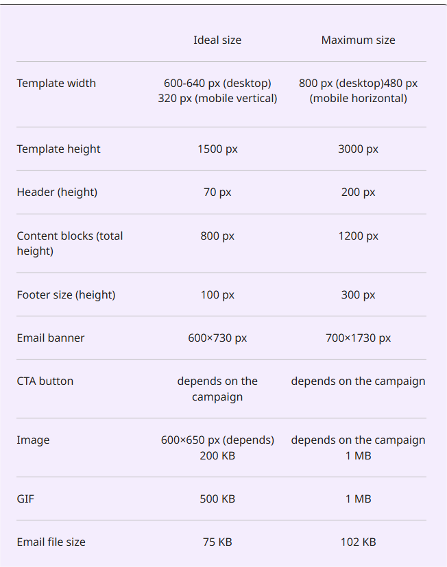
Image Source: Selzy
By designing content blocks in a way that they can stack on top of each other in responsive mode, you ensure your email remains readable across all devices.
3. Use inline CSS for better compatibility
In email design, external stylesheets often don’t work properly because many email clients strip them out. To solve this, it’s best to use inline CSS, which means adding styles directly to HTML elements.
For example, if you want to set the text colour, font size, or padding in your email, you should do it inline, like this: <p style=”font-size:16px; color:#333;”>.
This helps keep your design consistent. Tools like Premailer can help automate the process by converting your internal styles into inline styles, making sure your email looks great across all email clients.
4. Optimise images and use alt text effectively
To make sure your email loads quickly, optimise images by compressing them without losing quality.
Use formats like PNG or JPEG for small file sizes. When slicing your PSD design, specify the width and height for each image to prevent layout shifts. For example, a large hero image should be compressed to load faster but still look sharp.
Adding alt text to images is also important because it helps people who use screen readers or when images are blocked in email clients. For instance, if you have a product image, alt text like “Blue running shoes with white soles” gives context to users who can’t see the image.
5. Test across multiple email clients and devices
Different email clients, like Gmail, Outlook, and Apple Mail, render emails in their way, so it’s important to test your email design thoroughly.
Tools such as Litmus or Email on Acid let you preview your email on various clients and devices, helping you spot any issues. For example, check for broken layouts, missing images, or parts that aren’t displaying correctly on mobile. This ensures your email looks great no matter where it’s opened, providing a seamless user experience. Testing helps catch problems before you send, saving time and preventing poor user experiences.
6. Keep the code clean and avoid unnecessary elements
When converting PSD to HTML, it’s crucial to keep the code clean and simple. Avoid adding unnecessary divs, complex CSS, or elements that might not be supported by all email clients. Stick to semantic HTML for better structure and accessibility.
For example, use <table> for layouts instead of complex CSS grid systems. Also, steer clear of JavaScript as it’s often disabled in many email clients.
A lightweight email loads faster, improving both the user experience and engagement. The cleaner your code, the more likely your email will display properly across various platforms and devices.
Conclusion
Converting PSD designs into responsive HTML emails is a mix of design precision and coding best practices. By focusing on mobile-first design, inline styles, image optimization, and thorough testing, developers can ensure a consistent and high-quality experience across all devices and email clients. Following these guidelines not only improves deliverability but also enhances user engagement, making emails more effective in reaching their intended audience.