
There’s a moment I recognise, again and again: an artist who’s used to making for the studio realises their work now has to sell in thirty seconds on a screen. It’s a funny little shock, suddenly composition and craft meet product hierarchy and checkout funnels. That translation is messy, practical and often enlightening. If you want your creative work to look its best and keep working reliably, pair your instinct with disciplined upkeep: routine technical checks and fixes via a retainer for Shopify support and maintenance stop a theme update or a stray third‑party script from undoing weeks of careful design.
Below is a practical, human guide to that shift: what changes in how you think, which small skills make the biggest difference, the errors that keep repeating, and a tight checklist you can run before you push a product live.
Table of Contents
The mindset shift: from making to selling
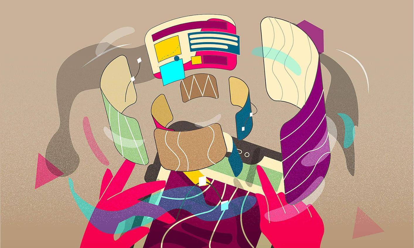
In the studio you celebrate nuance: a shadow, a stitch, a texture. Online, most people don’t pause to study. They glance, they skim and they decide. The move from artist to online designer is not about sacrificing craft; it’s about prioritising what communicates fastest.
Three mental changes help:
- Make the important thing legible at a glance: price, size, add-to-cart.
- Think modular: product pages are built from repeatable blocks, hero, gallery, details, reviews. Modular thinking scales.
- Measure, don’t guess: small experiments and data tell you which visual choices actually move buyers.
Artists who learn to ask “what will the shopper see first?” change the work without losing its soul.
Small technical habits that matter
You don’t need to learn to code deeply, but a handful of habits will protect your design and save you time.
Photography and exports
- Keep masters, then export web-optimised variants. Use a controlled backdrop and consistent crop ratios.
- Serve responsive images so the browser delivers an appropriately sized file to each device; Google’s guidance on responsive images explains how to do this efficiently (https://web.dev/uses-responsive-images/).
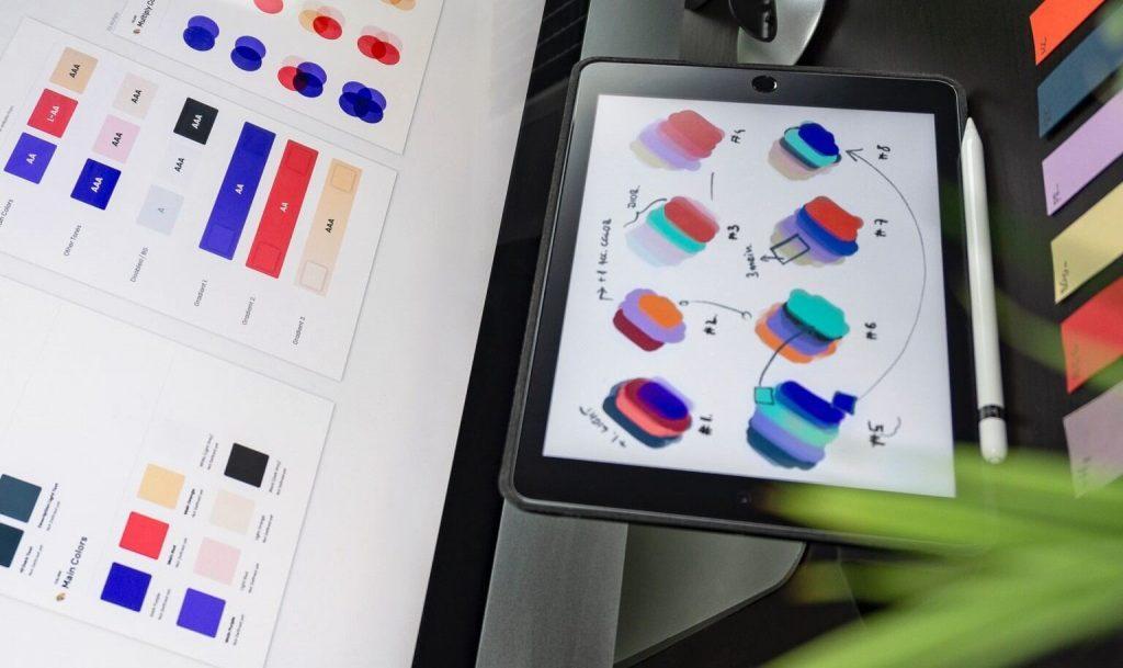
Visual system basics
- Two fonts only: one for headings, one for body. Too many choices dilute a page.
- A restrained palette: base, accent, and a UI colour for CTAs.
- Spacing rules: pick a rhythm and stick to it; it makes pages feel coherent even when content changes.
Performance and accessibility
- Prefer one evocative lifestyle shot plus a couple of detail images, not a dozen near-identical pictures.
- Defer non-essential scripts and lazy-load offscreen images to improve perceived speed; Core Web Vitals are a helpful metric set to monitor (https://web.dev/vitals/).
- Respect reduced-motion and contrast preferences; W3C’s accessibility resources show what to check to avoid excluding people (https://www.w3.org/WAI/).
These practices are small but multiply: better images, predictable layout and faster pages equal fewer abandoned carts.
Design moves that actually lift sales
Artists often want to show everything. Shoppers want to know enough to buy. The compromise is not dull, it’s deliberate.
- Lead with context: a well-shot image that shows the product in use adds meaning and reduces doubt.
- Make the buying area obvious: size selection, price and the CTA should be visible without hunting.
- Use white space as a tool: it focuses attention.
- Keep storytelling short: a pithy line about craft or materials, followed by clear specs and shipping info for those who need details.
These are staging decisions, not creative betrayals. They let the art read fast and sell.
Common traps I still see
I visit a lot of stores; the mistakes repeat.
- Massive image files. They look terrific in the editor, then kill load times. Use responsive srcset and compressed formats.
- Over-design. Multiple fonts, ornamental borders, animated flourishes, these create visual noise and harm legibility.
- Mobile as an afterthought. If a layout collapses on a small screen, conversions will suffer. Test on a real cheap Android, it will show the problems you don’t see on a MacBook.
- No maintenance plan. Theme updates and new apps often change CSS or class names; without checks, subtle breakages appear in production.
You can head most of this off with a photo standard, a short style guide and a QA checklist that runs before and after updates.
How to work with developers without arguing
Creative and technical people argue when they don’t share simple tools. Reduce friction with these habits.
- Explain intent, not code. Say what the interaction must do for the user, not how it must be implemented.
- Use annotated screenshots. A markup that says “keep visible on scroll” is clearer than paragraphs.
- Agree fallbacks. If an animation is heavy, have a simpler CSS-only version ready.
- Schedule a quick QA pass after each theme or plugin update.
Good collaboration is about shared constraints, not winning the argument.
Quick checklist before you press publish
- Are primary images optimised and included in responsive srcset?
- Is the main CTA visible on the first mobile screen?
- Are fonts, spacing and colours consistent across key pages?
- Have you run a speed test on a real low-end device?
- Does the site respect prefers-reduced-motion for animations?
- Are add-to-cart and checkout events tracked in analytics?
Fifteen minutes on this list prevents a lot of predictable headaches.
Maintaining design over time
A website is never finished. You’ll add products, update themes and try marketing apps. That’s why maintenance matters: quick checks after updates, fixes for conflicting scripts and periodic performance audits keep the look and the experience intact. If you’d rather not run these checks yourself, a maintenance retainer is a sensible choice; it’s part of the practical hygiene that lets your creative work keep performing on a platform.
If you want a view of what that maintenance looks like in practice, see a retailer-focused editorial feed for tone and examples at Hickman Design’s blog .
Image suggestions for publication
- An artist photographing a product with a laptop in the frame showing a draft product page.
- Before-and-after product pages: cluttered versus refined.
- A hand holding a phone with an annotated product page showing the CTA and hero image.
What to remember
Artists make the best designers online when they learn to frame their work for the medium. Keep images lean, make the buying path obvious and measure the effect of your choices. Document your visual rules, test on real devices and protect your pages with regular maintenance so updates don’t unravel your best work. That way the art isn’t just admired; it’s found, understood and bought.