Video game visual styles do more than make a game look attractive—they shape gameplay mechanics, set the mood, and deepen player immersion. Every artistic choice, from colour palettes to character design, becomes an integral part of the experience, blending visual design with interactive storytelling.
Table of Contents
The Role of Art Styles in Gameplay
Every video game is a carefully crafted endeavour, from indie projects developed over a few months to blockbuster titles that take years to perfect. The level of dedication and detail involved in creating a game means that nothing is left to chance—especially when it comes to art style, which is one of the most deliberate and defining aspects of the experience. Whether you’re exploring a new world with an xbox game pass key or revisiting a classic, the visual identity sets the tone from the very first moment.
A game’s art style often defines not only its visual appeal but also its genre, given its impact on gameplay experience. For instance, the pixelated landscapes of early 8-bit games evoke nostalgia, inviting players into worlds that feel delightfully retro and straightforward. On the other hand, hyper-realistic graphics in modern titles blur the line between reality and fiction, creating immersive experiences that pull players deeper into the game world.
But just as with any other type of artistic expression, art styles in video games go far beyond: they tell their own story, shaping how players experience and interpret the game world. From the stark, minimalist worlds of indie games to the richly detailed realms of AAA titles, each art style is crafted with a purpose, creating an atmosphere that guides players emotionally and aesthetically.
In the words of Jenova Chen, “When you direct a film or game, visuals are one of the elements that are very useful to help communicate an arc of emotion. You want to make sure all the sounds and visuals and gameplay and music all work together.” (Fast Company, “Game Designer Jenova Chen On The Art Behind His ‘Journey’”)
The choice of style can also dictate game mechanics, tightly tied to its emotional tone; think of games like Limbo (Playdead), where the haunting black-and-white palette intensifies the eerie and suspenseful gameplay. Or Cuphead (StudioMDHR), where the hand-drawn, 1930s cartoon-inspired visuals set a playful yet challenging tone, blending nostalgia with high-stakes action.
Video Game Art vs. Visual Design: What’s the Difference?
In the world of game development, video game art and visual design might seem like interchangeable terms, but they each play a distinct role in crafting a cohesive experience.
Video game art focuses on the creation of everything and anything that brings a game’s world to life—from characters and environments to textures and colour schemes. It’s about building the aesthetic appeal and mood that players interact with directly, using the style and visual elements that give each game its unique flavour.
Visual design, on the other hand, is about the strategic planning of how players will engage with those visuals. It’s the blueprint that ensures a smooth and intuitive experience, guiding players’ eyes to key details, cues, and interfaces. For instance, in a fast-paced game like Overwatch (Blizzard Entertainment), visual design is critical in highlighting characters and distinguishing them from the environment to prevent players from missing important actions.
So, while video game art pulls players into the world, visual design subtly shapes how they navigate and respond to it, blending artistry with functionality.
| Video Game Art | Visual Design |
| Creates assets and aesthetic elements, like characters, environments, and textures. | Directs the player’s attention to essential gameplay elements and interfaces. |
| Focuses on the mood, style, and visual identity of the game. | Prioritises clarity and functionality to support intuitive gameplay. |
| Engages players emotionally through the world and characters. | Blends layout and accessibility to enhance the player experience. |
Key Visual Styles in Video Games
Pixel Art:
- Origin: Popularised by Donkey Kong (1981) and earlier arcade games.
- Legacy: Became iconic during the 8-bit and 16-bit eras with games like Super Mario Bros. (1985) and The Legend of Zelda (1986).
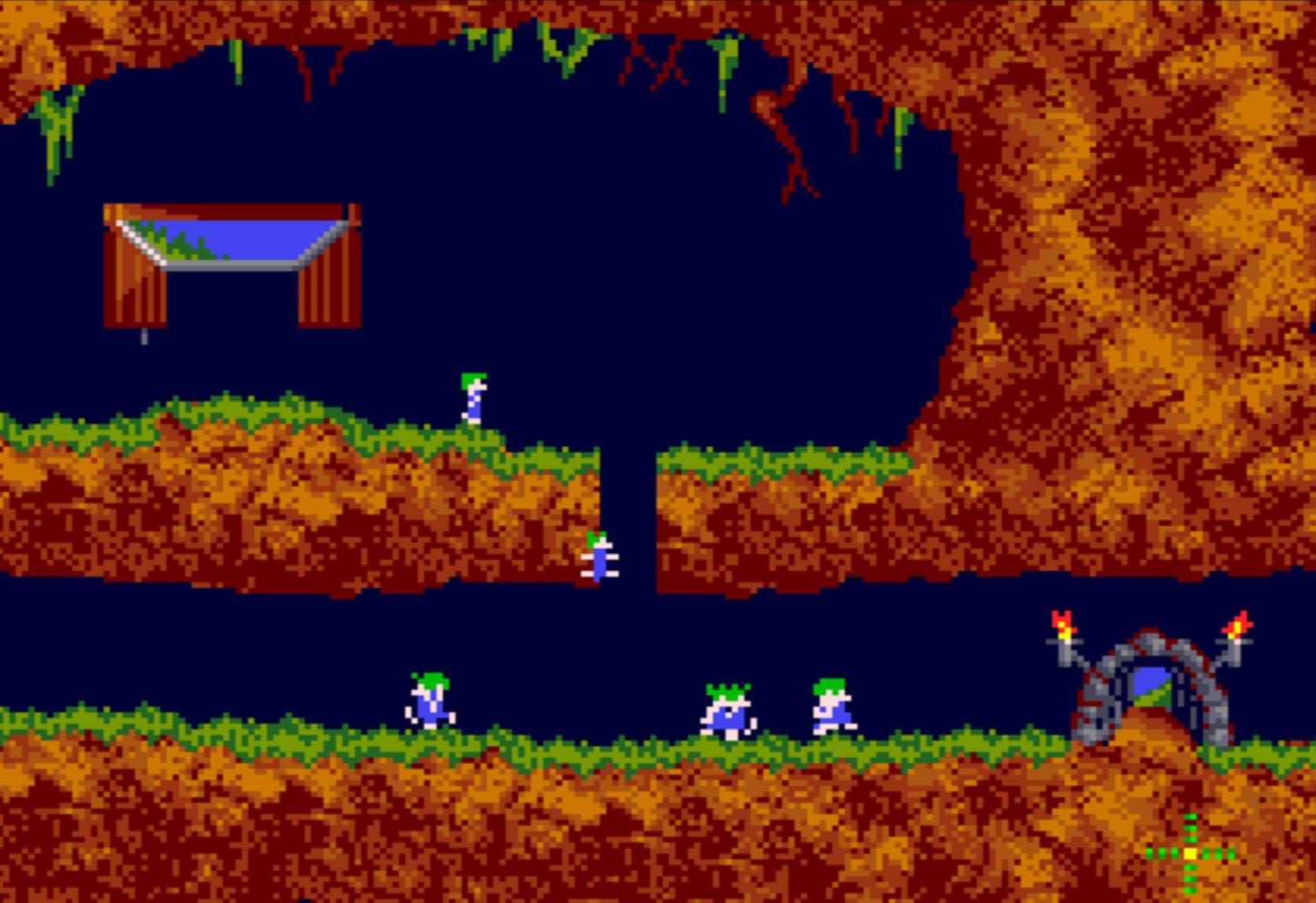
Pixel art first emerged as a practical solution to the technical limitations of early gaming hardware, where each pixel needed to be carefully placed to create recognisable images on low-resolution screens. However, over time, it evolved beyond a necessity and into a beloved art form.
Today, Pixel art has become a symbol of the golden age of video games in the ‘80s and early ‘90s, as it retains a nostalgic charm for many gamers, like Luke, who owns this site—he grew up playing Lemmings (DMA Design) on his dad’s old Amiga. Or even me: Age of Empires (Ensemble Studios) was the first game where my brother bested me, although I always preferred Zeus: Master of Olympus (Impressions Games), which is now the only game my poor old laptop can handle.
In classics like Super Mario Bros. and The Legend of Zelda (both by Nintendo), pixel art was not just a visual choice; it was an essential aspect of how these worlds came to life. With only a few pixels to work with, game designers had to be incredibly creative, using every dot to convey expression, motion, and personality. For instance, Mario’s distinct red-and-blue colour scheme and moustache were designed to make the character recognisable despite the limitations. Likewise, the sparse yet vivid environments of The Legend of Zelda offered players a sense of mystery and adventure, inspiring the imaginations of players worldwide.
More recently, pixel art has enjoyed a significant revival in modern indie games. Titles like Celeste (Maddy Makes Games) and Stardew Valley (Eric “ConcernedApe” Barone) have proven that pixel art is far from outdated. In fact, its simplicity can enhance storytelling by inviting players to fill in the details themselves, thus increasing immersion.
Pixel Art Key Features:
- Limited Colour Palette: Often uses a small set of colours, relying on contrast to create visual impact and recognisable shapes.
- Simple, Blocky Shapes: Defined by square pixels, resulting in a characteristic “blockiness” that artists use to their advantage.
- Expressive Minimalism: Encourages creativity through constraint, where even tiny changes make a big difference.
- Nostalgic Appeal: Evokes a retro feel, resonating with fans of early video games and the 8-bit/16-bit eras.
- Clarity of Form: Emphasis on recognisable shapes and characters, even with few details, to convey action and emotion.
- Timeless Design: Has a lasting aesthetic that can feel fresh and engaging despite—or even because of—its simplicity.
3D Realism:
- Origin: Quake (1996) was one of the first games to attempt fully textured 3D environments. This led to greater graphical fidelity in titles like Half-Life (1998).
- Notable Milestone: The Last of Us Part II (2020) pushed the limits of photorealism, with lifelike characters and environments.
The quest for realism in video games has been a driving force behind advances in both technology and artistry. As hardware improved, games moved beyond pixelated graphics to 3D models, eventually aiming for photorealistic visuals that could immerse players in lifelike worlds. This shift toward realism allows players to step into rich, expansive environments that feel tangibly real, fostering an unprecedented level of immersion.
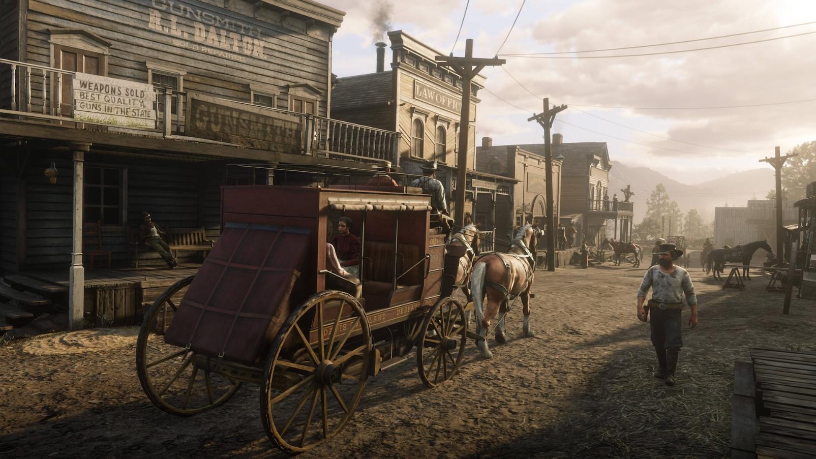
Games like The Last of Us (by Naughty Dog and Sony Interactive Entertainment) and Red Dead Redemption 2 (Rockstar Games) exemplify this trend, with visuals so meticulously detailed that they blur the lines between game and reality. From the intricate facial expressions and subtle movements of characters to the dynamic weather and natural lighting in landscapes, every element works in harmony to pull players deeper into the story.
The concept art behind these games is equally awe-inspiring. For instance, in Halo, concept artists have crafted epic, futuristic worlds that establish a grand sense of scale and mystery. The concept art provides a blueprint for the world’s realism, setting a visual tone that makes players feel part of something vast and otherworldly. Yet, it was its ahead-of-its-time playability options— like the beloved split-screen multiplayer that had Luke and his friends spending hours shooting aliens and bonding over their efforts to end the Human-Covenant War—that fostered a unique sense of community. Players didn’t just experience Halo’s epic world; they shared it, forging life-long friendships and rivalries right in their living rooms, and building memories through a gameplay that felt personal and relatable, even if the Spartan soldiers never showed their faces.
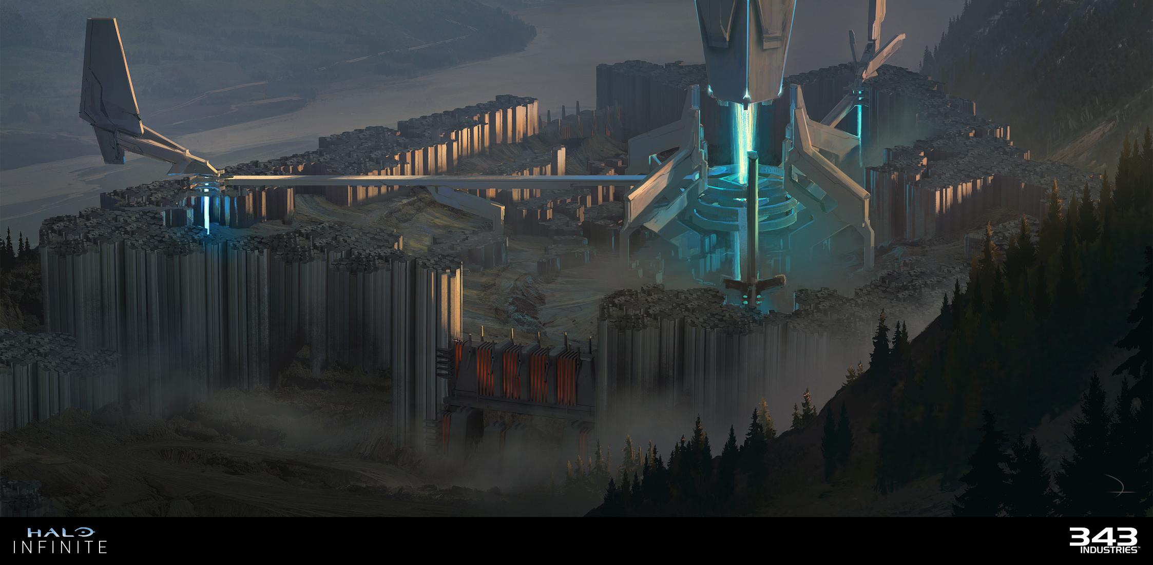
Halo Infinite Spire Base Structure – Martin Deschambault Artstation
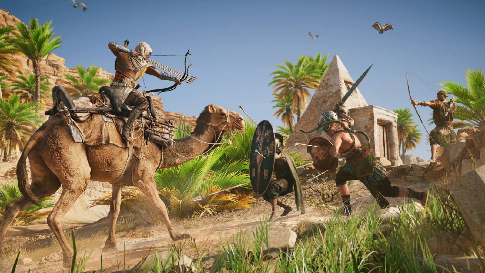
Assassin’s Creed Unity (Ubisoft) takes this mission a step further, with its painstakingly detailed recreation of historical Paris, including Notre Dame Cathedral. So much so that, after the tragic fire at Notre Dame in 2019, Ubisoft’s digital model from Unity was referenced in the restoration efforts. With high-resolution textures and faithful reproductions of architectural details, the game’s rendering of the cathedral became a valuable resource for architects and historians, demonstrating how realism in games can bridge into real-world heritage preservation.
3D Realism Key Features:
- Photorealistic Detail: High-resolution textures and lighting effects create lifelike environments and character models.
- Dynamic Lighting and Weather: Real-time lighting, shadows, and weather effects contribute to an immersive atmosphere.
- Detailed World-building: Includes intricate architecture, landscapes, and textures, bringing environments to life.
- Expressive Character Animation: Facial expressions, body language, and subtle movements enhance emotional storytelling.
- Historical and Real-World Accuracy: Realistic recreations of locations, such as Paris in Assassin’s Creed Unity, even contribute to projects like Notre Dame’s restoration.
- Concept Art Foundations: Concept art sets the visual tone, blending realism with creativity, helping artists develop worlds that are both detailed and captivating.
Cel-Shading:
- Origin: First seen in Jet Set Radio (2000), which used bold lines and flat shading to mimic comic book aesthetics.
- Key Milestone: The Legend of Zelda: Wind Waker (2002) refined the technique, blending it with vibrant colours and fluid animations.
Cel-shading is a distinctive video game visual style in gaming that draws inspiration from the flat, bold lines of comic books and animation. By simplifying shading and adding dark outlines, cel-shaded games achieve a cartoon-like aesthetic that stands out from more realistic 3D graphics. This adds a playful or adventurous tone to games, making them feel vivid and visually expressive.
The Legend of Zelda: Wind Waker (Nintendo) is a classic example of cel-shading done right. When Wind Waker first launched, its bright, whimsical visuals initially divided fans, but the style ultimately contributed to the game’s lasting charm. The bold colours, soft gradients, and stylised character designs make its world feel like a moving storybook, which perfectly matches its adventurous spirit. Meanwhile, Cel Damage (Pseudo Interactive) takes a more playful approach, with exaggerated, cartoonish visuals that make its chaotic car combat feel like a slapstick cartoon brought to life.
But cartoons are not always cute, and cel-shading can convey many different tones. XIII (PlayMagic), inspired by graphic novels, uses the style to immerse players in a gritty spy thriller. The game enhances its visual storytelling with comic-book elements like speech bubbles and panelling, emphasising the mystery and intensity of its narrative. Similarly, with bold outlines and colour palette that match the game’s over-the-top humour and action, Borderlands (Gearbox Software) visually distinguishes itself from other shooters, crafting a world that’s unmistakably its own.
These stylistic choices show cel-shading’s versatility, as it can adapt to both light-hearted and suspenseful atmospheres.
Similarly, Borderlands uses cel-shading to establish its unique, edgy tone. The rough, hand-drawn lines and exaggerated shadows in Borderlands create a comic book feel that matches the game’s over-the-top humour and action. With its bold outlines and gritty colour palette, Borderlands visually distinguishes itself from other shooters, crafting a world that’s unmistakably its own.
Cell Shading Key Features:
- Bold Outlines: Dark outlines around characters and objects create a hand-drawn, comic book effect.
- Flat Colour Shading: Simple, flat colour gradients replace complex lighting and shadows, giving a clean, animated look.
- High Contrast: Strong colour contrasts add visual clarity, helping characters and objects stand out.
- Stylised Visuals: Emphasises exaggerated or stylised shapes, making characters and environments feel more playful or larger-than-life.
- Vibrant Colour Palette: Often uses bright and contrasting colours, enhancing the mood and energy of the game.
- Unique Identity: Sets the game apart with a recognisable, art-driven style, adding to the game’s character and appeal.
Isometric / Tilt-Shift:
- Origin: First used in Zaxxon (1982), an arcade shooter by Sega, which introduced players to a three-dimensional illusion within a 2D plane, revolutionising spatial depth in gaming.
- Key Example: Diablo (1996) by Blizzard North, which cemented isometric visuals as a defining style in RPGs, combining atmospheric depth with immersive gameplay.
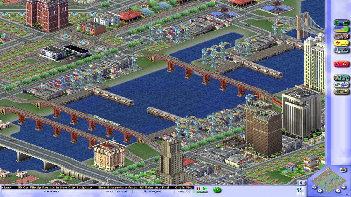
The isometric perspective is a distinctive visual style that presents a game world at a three-quarter angle, creating a “top-down” view without the distortion of traditional 3D. This perspective is particularly effective in simulation games, as it offers a clear view of a complex environment, allowing players to oversee and manage elements more easily. Video games designers use isometric art styles to add a sense of realism and charm, making the game world feel almost like a living diorama.
A classic example of isometric design is SimCity (EA Games). The isometric view in SimCity serves a practical purpose by letting players see an entire city layout from above, allowing them to plan roads, zones, and utilities with precision. But it’s more than just functional—there’s a unique charm in watching your city grow from this viewpoint. With the addition of tilt-shift, buildings and objects appear in sharp focus, while background elements blur slightly, adding a miniature-like quality to the scene that’s instantly recognisable to nostalgic gamers. Although it wasn’t one of my favourites (my citizens’ tax Simoleons always seemed to disappear before I could put them to good use—you’ll be glad to know electricity is as expensive in games as it is in real life), Luke fondly remembers playing SimCity at his friend’s house on the military base in Germany where they lived at the time.
But beyond city and civilisation simulators, the isometric view has become a popular choice across various genres due to its readability and aesthetic appeal. For instance, the Diablo games (Blizzard Entertainment) use an isometric view to immerse players in dark, dungeon-crawling environments. The perspective helps maintain a sense of depth and danger while giving players clear visibility of enemies and loot.
Project Zomboid (The Indie Stone) uses the isometric perspective in a similar way, bringing an eerie sense of realism to its survival modern-day horror setting, allowing players to strategically survey their surroundings whilst conversely creating a tense atmosphere where danger could lurk around any corner. And in Transistor, Supergiant Games again uses an isometric perspective to blend storytelling with strategic gameplay, as the isometric view offers clarity in combat and a cinematic feel, reinforcing the game’s sci-fi noir atmosphere.
Isometric Key Features:
- Three-Quarter Angle: Presents a “top-down” view without perspective distortion, perfect for strategy and simulation gameplay.
- Enhanced Depth with Tilt-Shift: Adds depth by blurring background elements slightly, giving the scene a miniature, diorama-like feel.
- Readability and Precision: Ideal for complex layouts, allowing players to see multiple elements clearly and plan efficiently.
- Miniature Effect: Makes environments feel compact and visually engaging, especially effective in city-building or management games.
- Functional Aesthetic: Balances beauty with utility, ensuring the visual style supports the player’s objectives within the game.
Low Poly Art:
- Origin: Became prominent with early 3D games like Virtua Fighter (1993) by Sega, which utilised simple, low-polygon models due to hardware limitations while pioneering 3D graphics in gaming.
- Key Example: Spyro the Dragon (1998) by Insomniac Games, showcasing low-poly art with vibrant colours and creative designs that gave the game a charming aesthetic, despite technological constraints.
Low poly art embraces simplicity, using fewer polygons to create clean, geometric shapes that convey a minimalist aesthetic. This style emerged partly from early 3D graphics limitations but has since become a deliberate choice in modern game design, especially within indie games. With the help of basic forms and flat colours, low poly art creates visually appealing worlds that are both stylish and efficient to render.
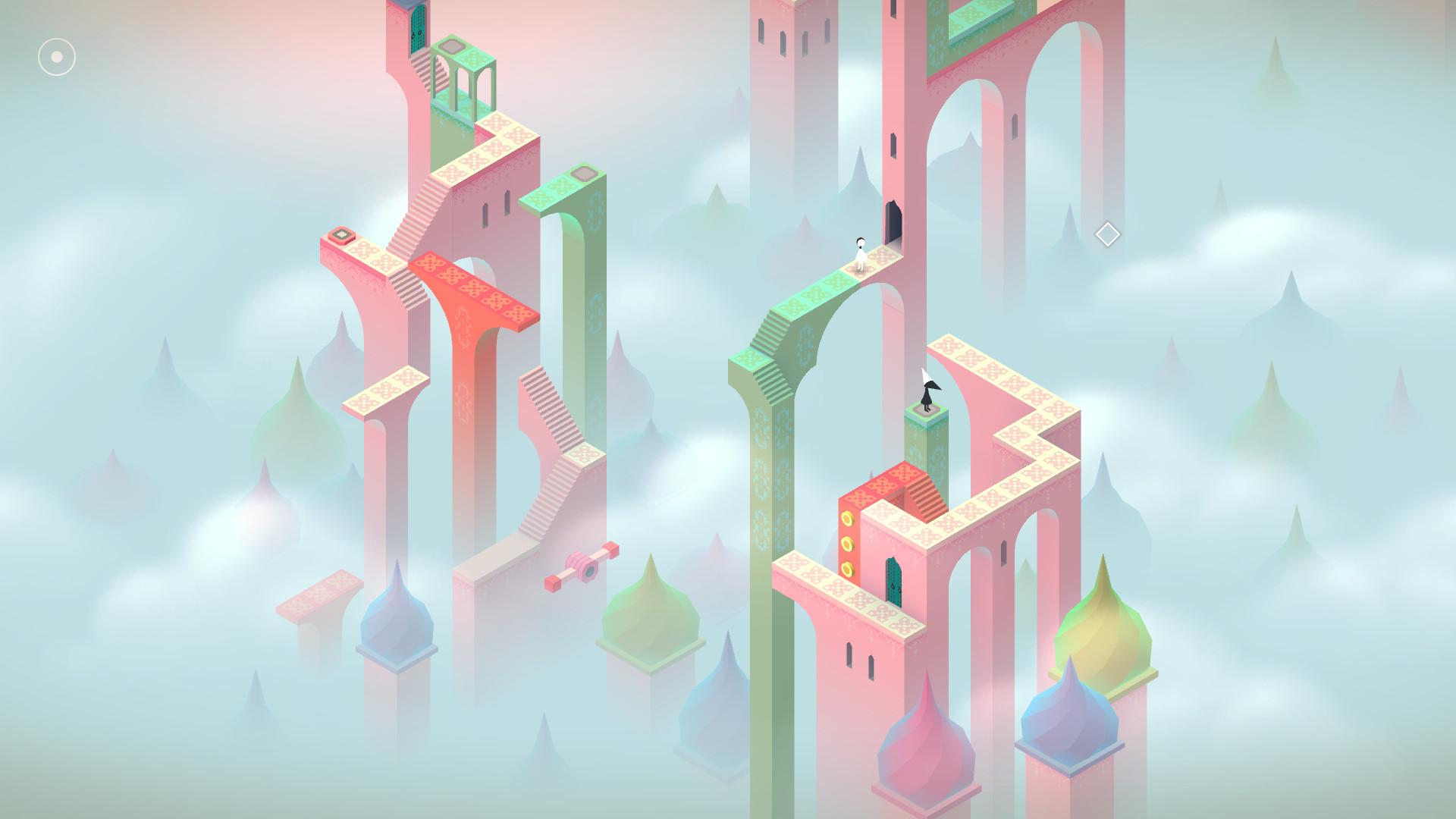
Monument Valley (Ustwo Games) is a perfect example of how low poly art can be used to create an elegant, dreamlike world. Its surreal, Escher-inspired environments rely on simple geometry and colour gradients, which in turn produce a calming visual experience that complements the game’s puzzling and meditative gameplay. The style allows players to focus on solving puzzles without the distraction of overly complex visuals, whilst making each scene feel both minimalistic and magical.
In a similar way, Untitled Goose Game (House House) embraces low poly aesthetics to create a humorous and charming experience. The blocky, simplified shapes of the characters and objects add to the game’s lighthearted tone, keeping the focus on the playful antics of the mischievous goose. The simplicity of the visuals enhances the game’s humour and accessibility, making it appealing to a broad audience.
Low Poly Art Key Features
- Simplified Geometric Shapes: Emphasises basic forms and reduces details, creating a clean and readable look.
- Minimalist Aesthetic: Uses fewer polygons, which often results in an abstract or stylised feel.
- Efficient Performance: Requires less computational power, making it ideal for indie developers and mobile games.
- Focus on Colour and Composition: Relies on colour schemes and layout instead of intricate detail to establish atmosphere.
- Playful or Calming Tone: Often used to create lighthearted or relaxing experiences, enhancing player enjoyment.
- Artistic Flexibility: Allows for a wide range of styles within its simplicity, from whimsical to surreal.
Hand-Drawn & 2D Animation:
- Origin: The style dates back to early arcade games like Dragon’s Lair (1983), created by animator Don Bluth. The game featured entirely hand-drawn animated sequences, setting it apart from pixel-based graphics of the era.
- Key Example: Cuphead (2017) by Studio MDHR, which revived and modernised the hand-drawn aesthetic, inspired by 1930s cartoons.
There is a certain warmth and nostalgia to video games that capture the charm of traditional animation with their hand-drawn visuals and 2D animation. Unlike 3D-rendered graphics, hand-drawn art focuses on intricate line work, dynamic shading, and stylised character designs, to create an experience that feels more like a moving painting or cartoon. This approach gives games a distinct artistic identity that allows them to connect with players on a more intimate, visual level.
Once again, Cuphead is a standout example, with its commitment to recreating the look and feel of 1930s-style animation. Every character, background, and movement in Cuphead is meticulously hand-drawn and animated to match the rubber hose animation style of the era, complete with grainy textures and vintage-inspired colour palettes. This dedication not only brings the game’s world to life but also evokes a sense of nostalgia and wonder, immersing players in a visual style that feels like it’s straight out of a classic cartoon.
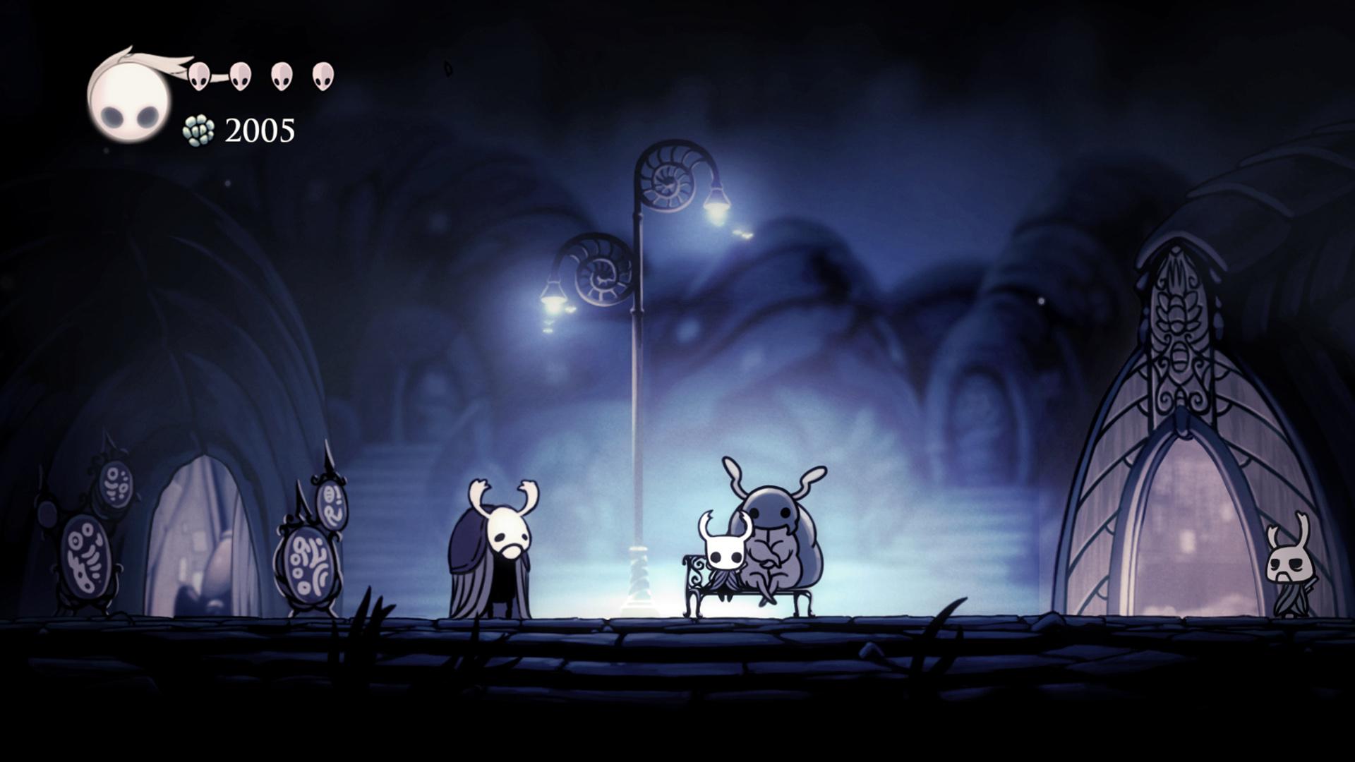
Similarly, Hollow Knight (Team Cherry) demonstrates the power of hand-drawn art in crafting a moody, atmospheric world. Its intricate environments, haunting character designs, and fluid animations combine to create a setting that feels vast and immersive, while still grounded in the delicate lines and rich textures of 2D art. The hand-drawn style in Hollow Knight conveys a sense of depth and personality in every corner of its world, making exploration both rewarding and visually captivating.
Hand-drawn Video Game Art Key Features:
- Intricate Line Work: Fine details and expressive lines give characters and environments a unique visual depth.
- Rich, Textured Backgrounds: Hand-drawn environments may feature lush details that enhance immersion and atmosphere.
- Fluid Animation Style: Often incorporates smooth, frame-by-frame animation for dynamic and expressive movement.
- Nostalgic Appeal: Reminiscent of traditional animation techniques, it creates a sense of warmth and familiarity.
- Distinct Art Identity: Enables a strong, recognisable style, helping games stand out visually and artistically.
- Emotional Impact: Hand-crafted visuals allow for nuanced storytelling and mood-setting, enhancing player connection.
When Functionality Becomes Art (and the Power of Apophenia)
Not every game is designed with a singular aesthetic vision aimed at beauty or realism. While some titles rely on design to immerse players in their settings, other games take a different approach, prioritising functionality and storytelling over visual detail. In some cases, the art in games emerges not from a purely aesthetic goal but from the need to solve practical challenges in game design, resulting in unique styles that enhance the player experience in unexpected ways.
Take RimWorld (Ludeon Studios), for example. The game’s visual style is minimalistic, and this simplicity was a deliberate choice to meet practical needs. As Tynan Sylvester, the developer, explained to us in an email, the art style was driven by the need to “be clear about what’s happening, be very cheap to create, don’t be ugly, don’t overwhelm with details […] and be abstract enough for players to make their own interpretation of what’s happening.” This approach meant sacrificing traditional aesthetics for clarity and efficiency. Sylvester describes it as a “solution to a problem” rather than a carefully crafted aesthetic. Yet, this functional style also invites players to read deeper meanings into the events they witness—a phenomenon known as apophenia. RimWorld’s design, in its sparseness, allows players to project their own narratives onto the game, adding emotional depth to the stories that emerge.
Similarly, games like Prison Architect (Introversion Software) and the original Dwarf Fortress (Bay 12 Games) embrace simple graphics, yet they’re beloved for the rich storytelling possibilities they offer. Prison Architect, through its simplicity, delivers powerful narratives and deep role-playing potential. The basic visuals allow players to focus on the stories unfolding in their prisons, building emotional connections with their creations that transcend the minimalist art style.
Dwarf Fortress, especially in its early ASCII-based version, takes this concept even further. The graphics are nothing more than ASCII symbols on a screen, yet players become deeply invested in the fates of their dwarven colonies. This is where the power of storytelling truly shines: two weeks into a save, players might find themselves captivated by the lives and routines of their dwarves, only to have one small disaster unravel the entire fortress. In Dwarf Fortress, this heartbreak and immersion are delivered not through realistic visuals but through simple symbols and text. The sparseness of the art forces players to fill in the gaps with their imagination, making each loss or victory feel intensely personal.
In these games, the functional, minimal art style becomes a canvas for the player’s creativity and emotional engagement. The simple artwork and text boxes create a powerful sense of immersion, as players find themselves projecting rich stories onto the limited visuals. An approach that proves that even when aesthetics are not the focus, a game can still offer an unforgettable, artful experience.
Conclusion
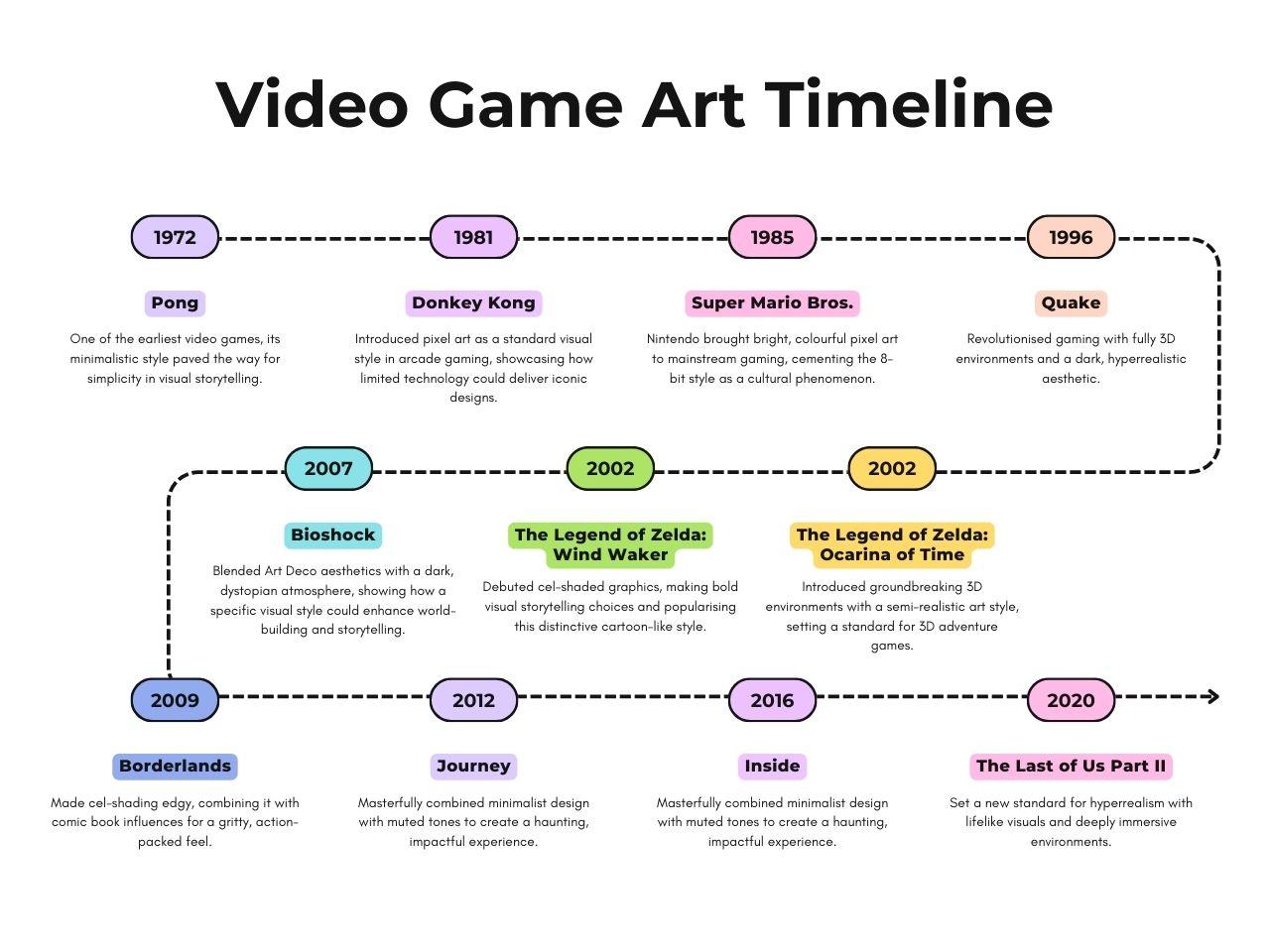 You don’t need to be an art expert to appreciate how aesthetics influence our emotions. A quick look at films across genres reveals this power: just think about the bright, whimsical visuals of a romantic comedy compared to the dark, unsettling tones of a horror movie. Each style draws viewers into different emotional states to shape their experiences and reactions to the story.
As I hope you will have seen throughout this (quite long) article, this works exactly the same when it comes to video games. But in the words of Raphael Lacoste, Assassin’s Creed Franchise Art Director, “If story and gameplay are not a success, art can’t save the experience (…). But it’s the same if the game is fun but not beautiful, a AAA Game has to be AAA everywhere.” It is the balance between storytelling, gameplay, and art that defines great games, turning them from mere entertainment into unforgettable, sometimes incredibly powerful experiences.
Ultimately, visual design doesn’t just set the stage—it transforms games into worlds we can explore, remember, and love, from the meticulous hyperrealism of The Last of Us, the playful stylisation of Journey, and the impactful simplicity of minimalist games like Inside or Monument Valley.


